UTSA Football Uniforms
Branding & Uniform Design
overview
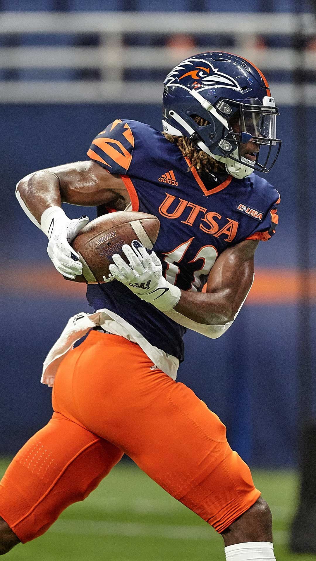
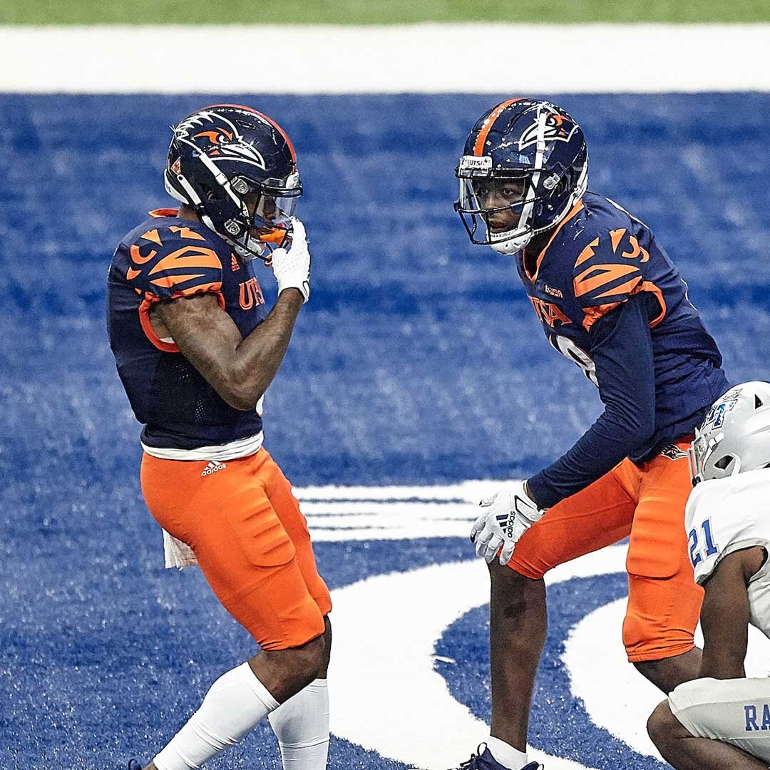
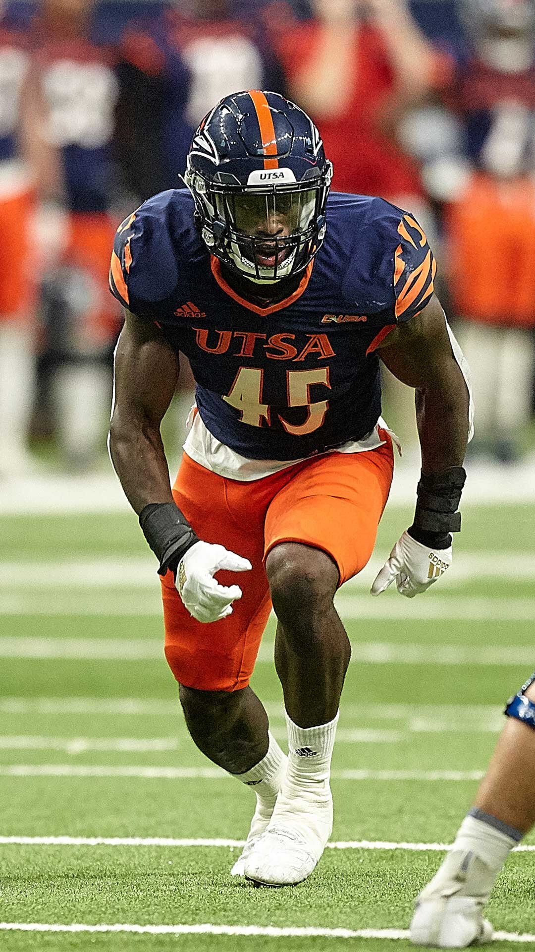
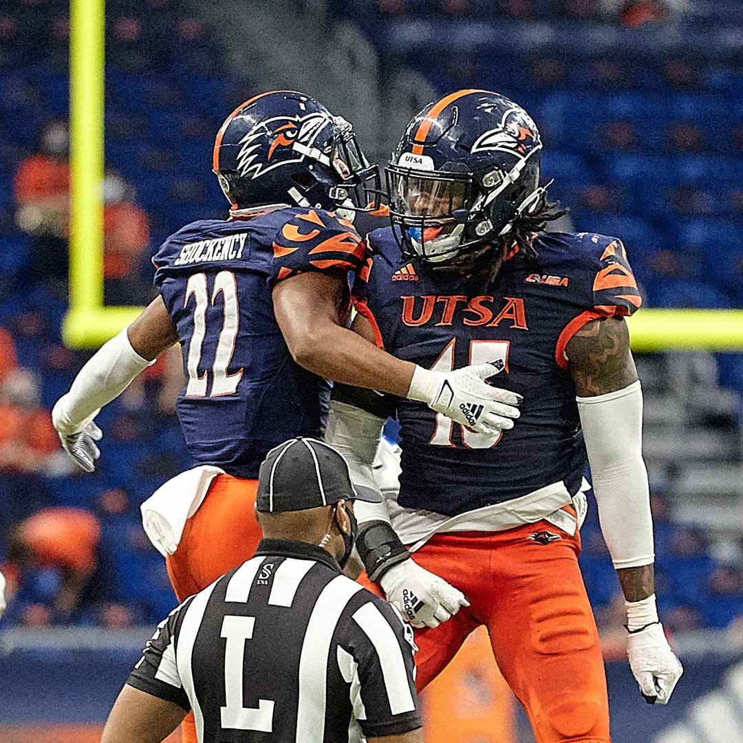
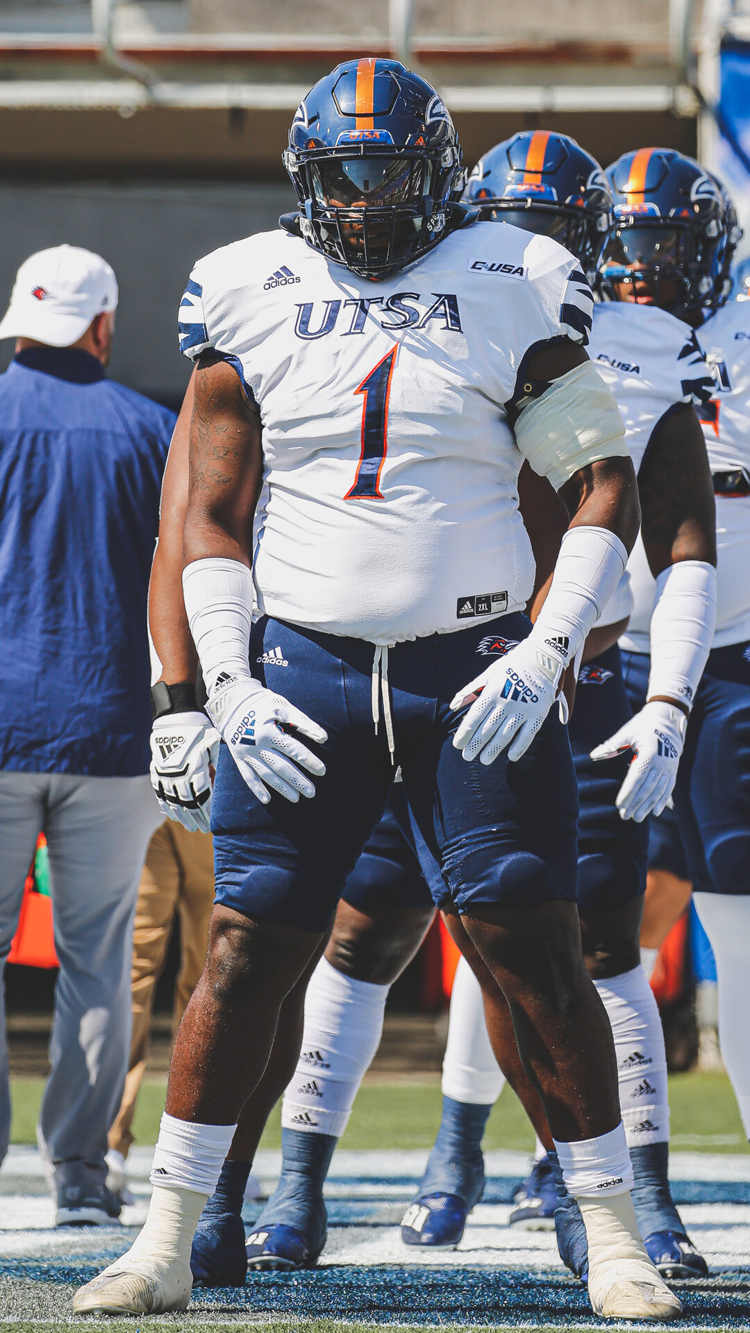
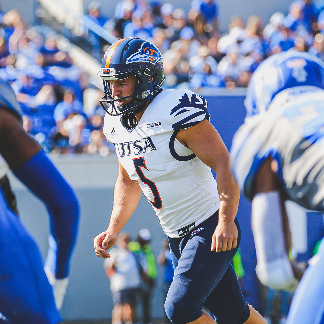
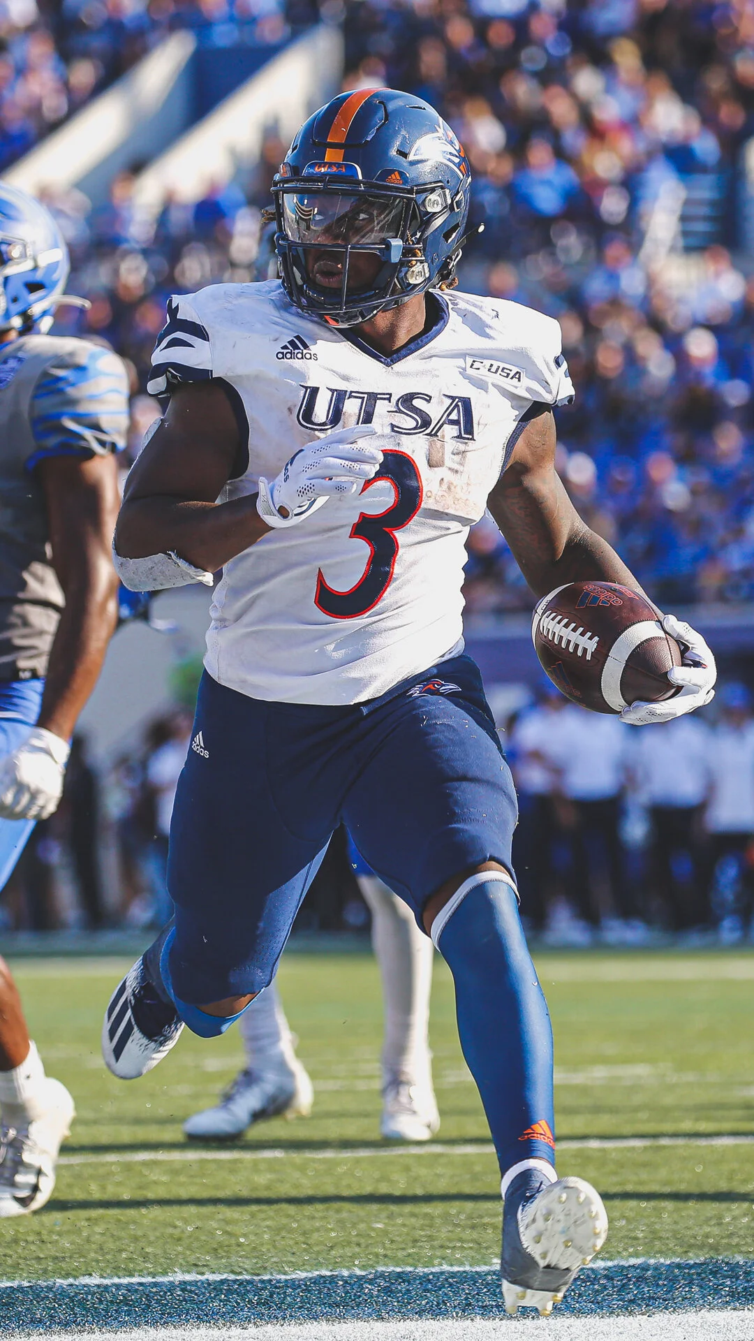
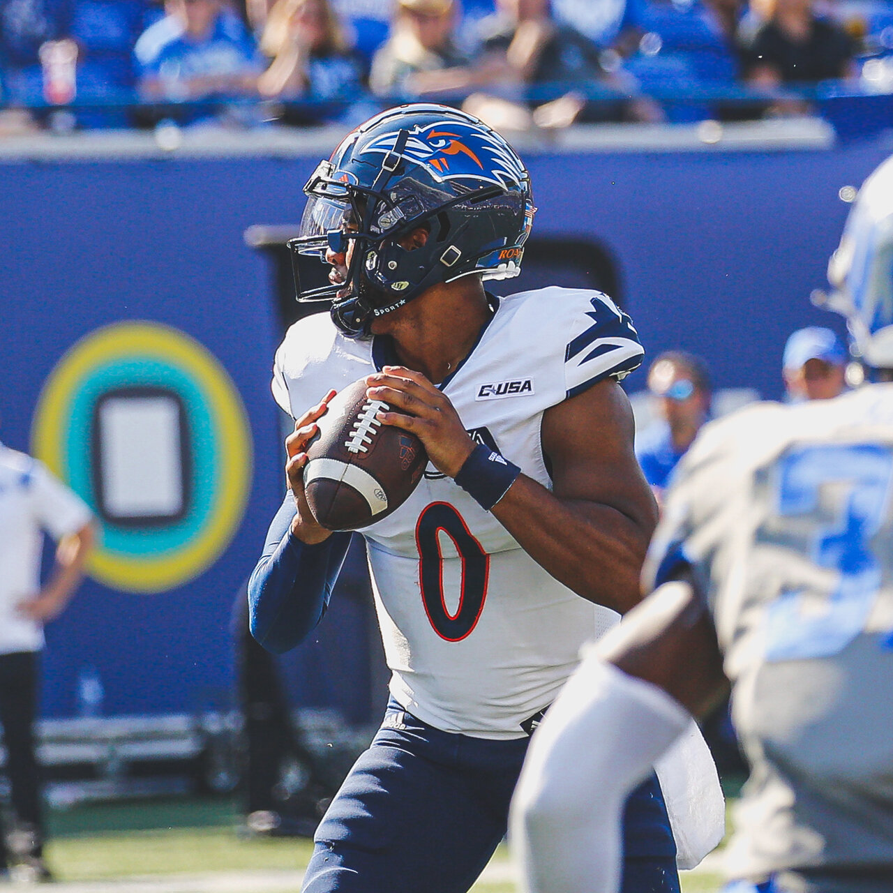
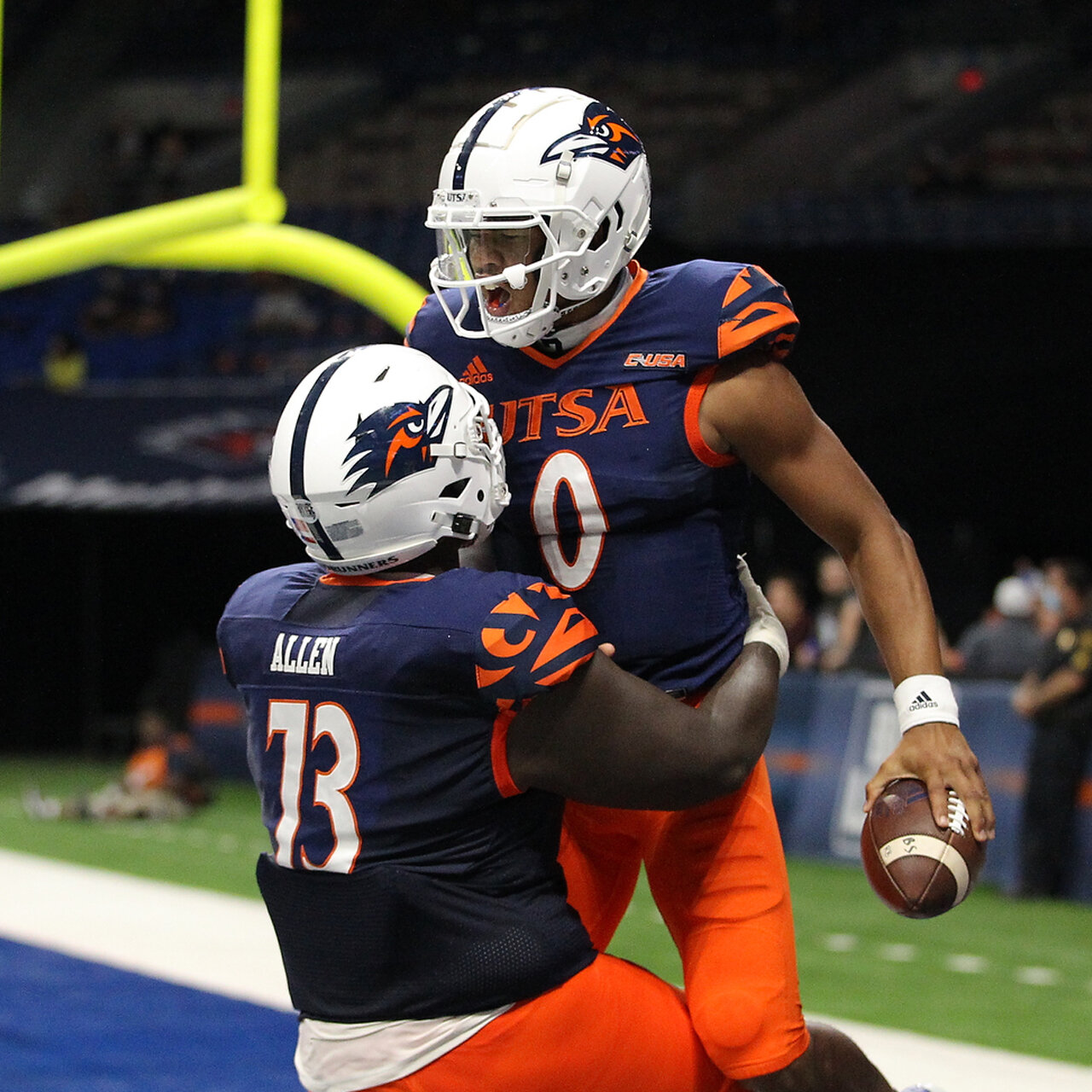
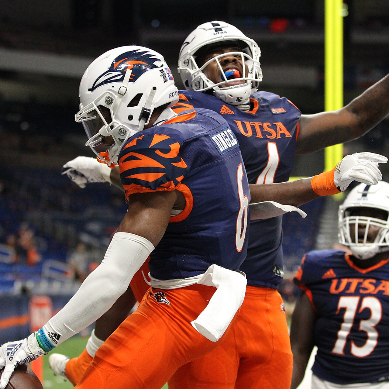
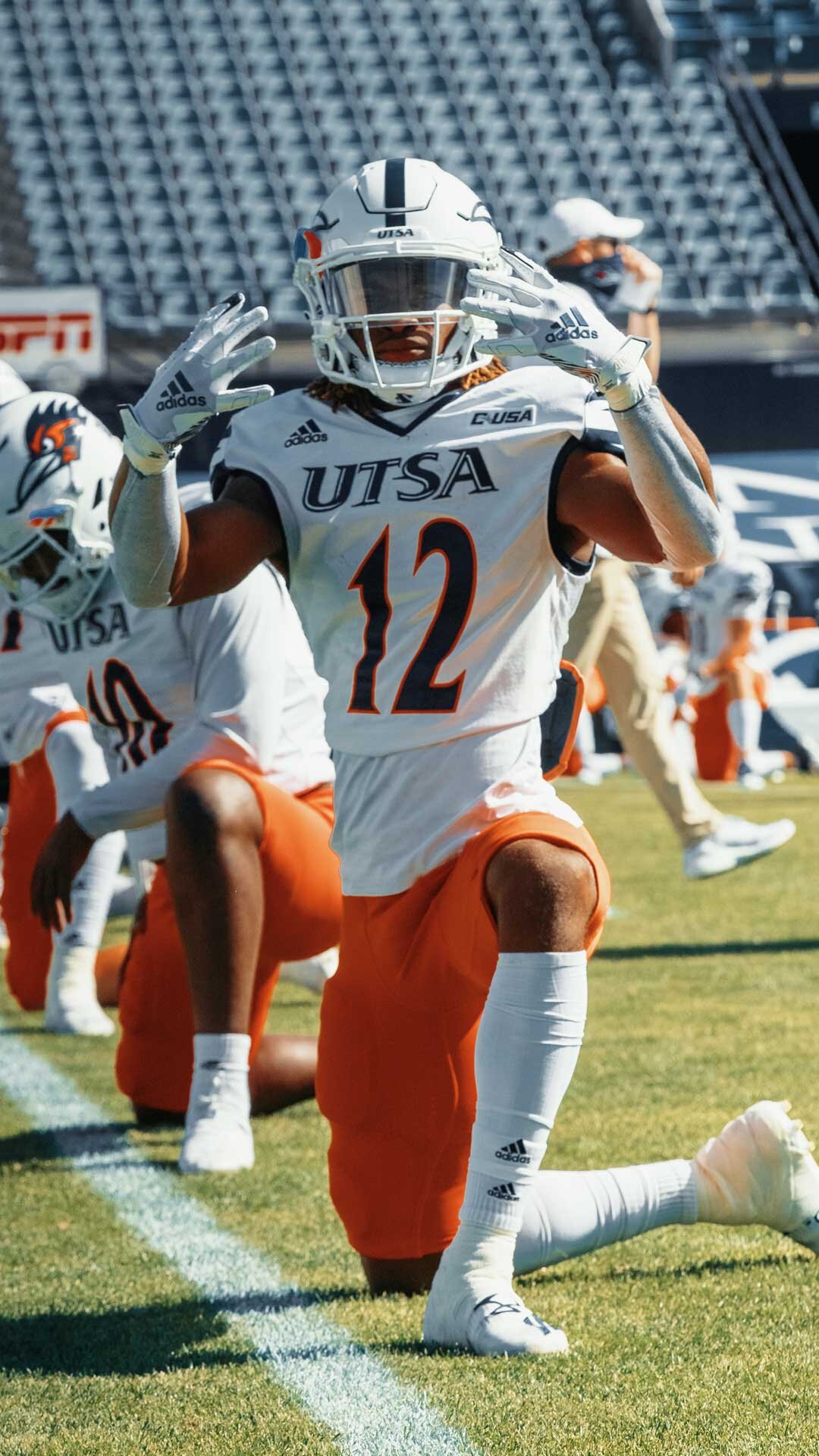
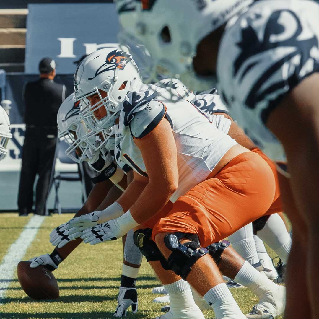
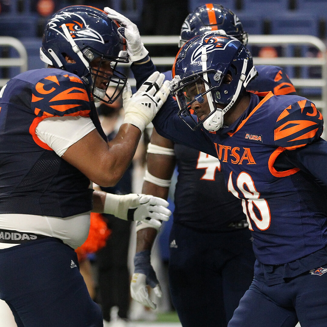
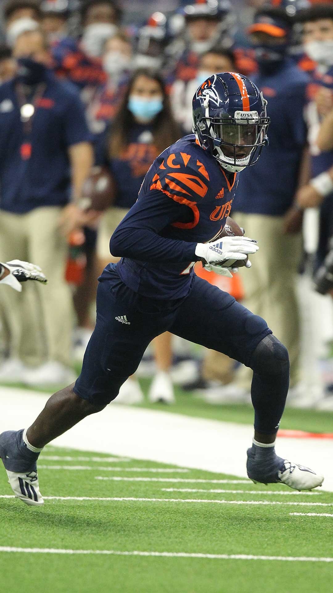
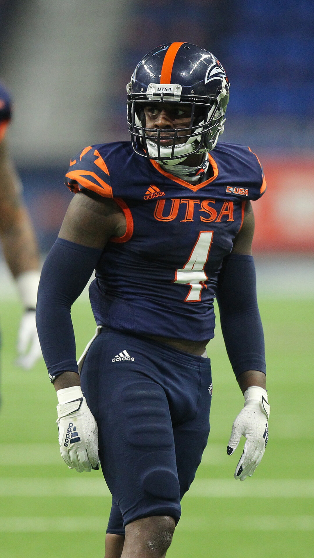
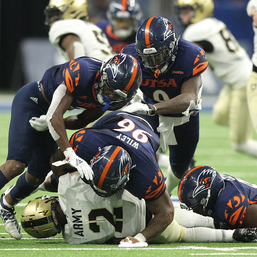
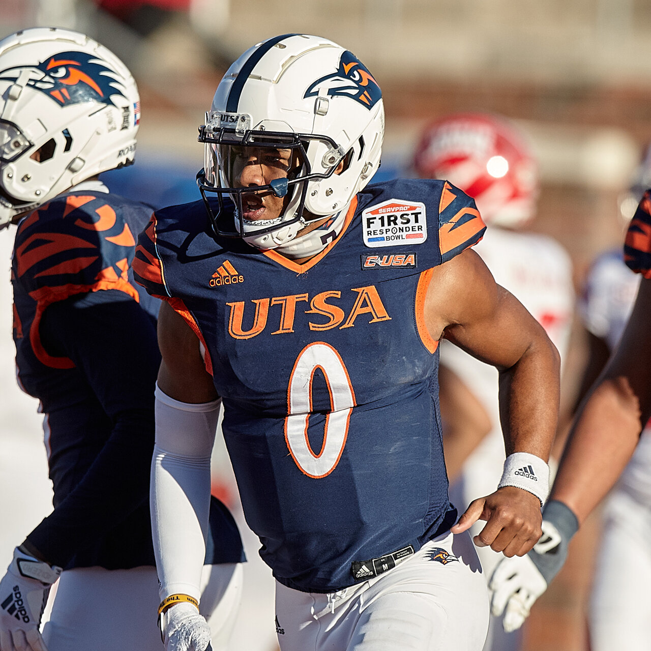
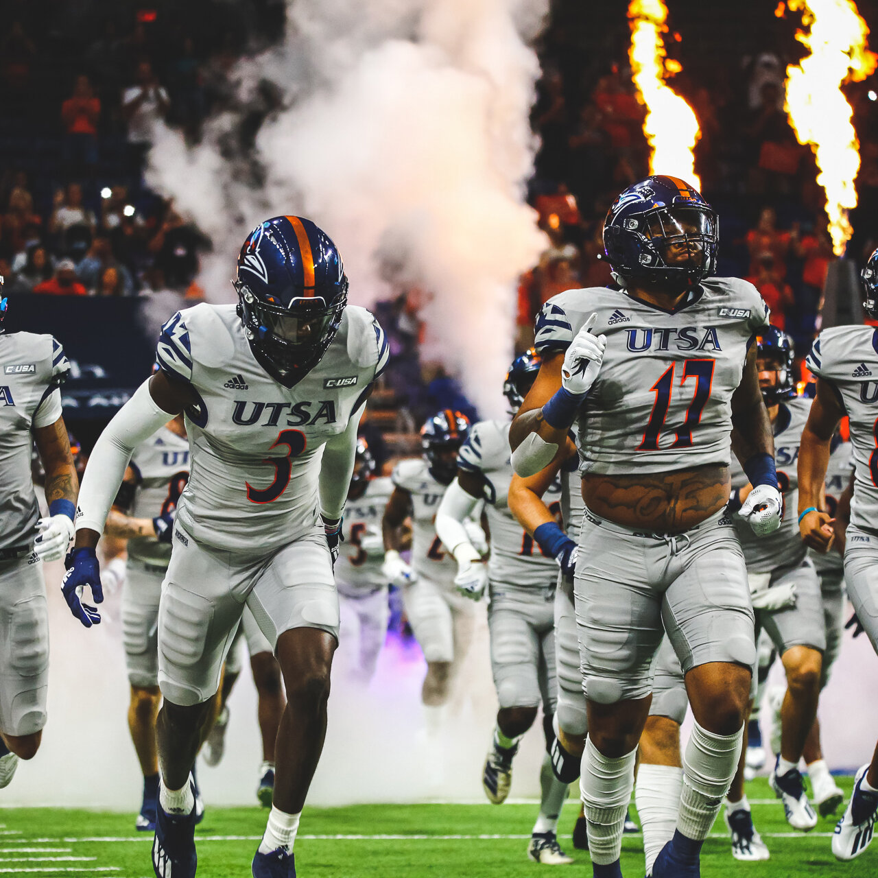
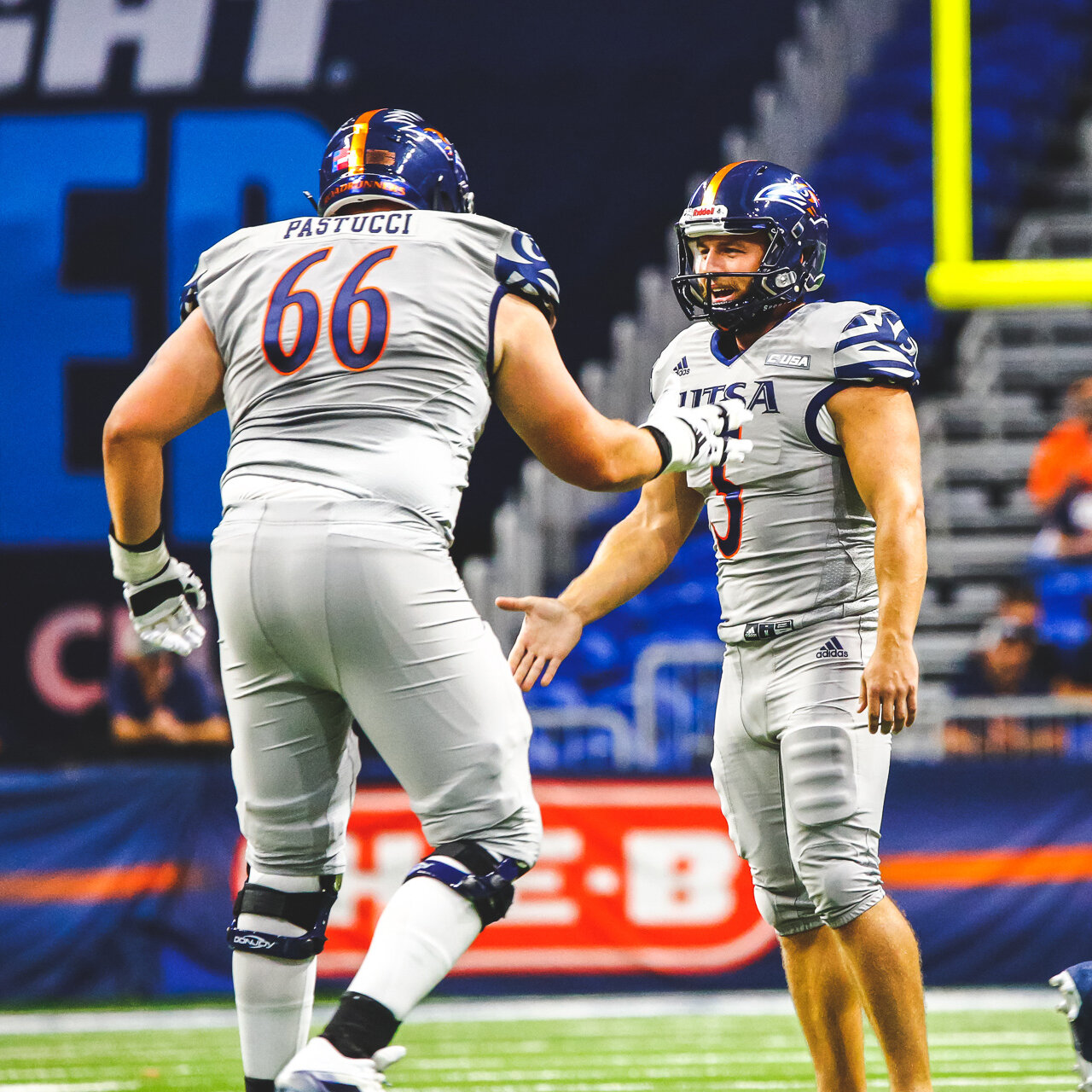
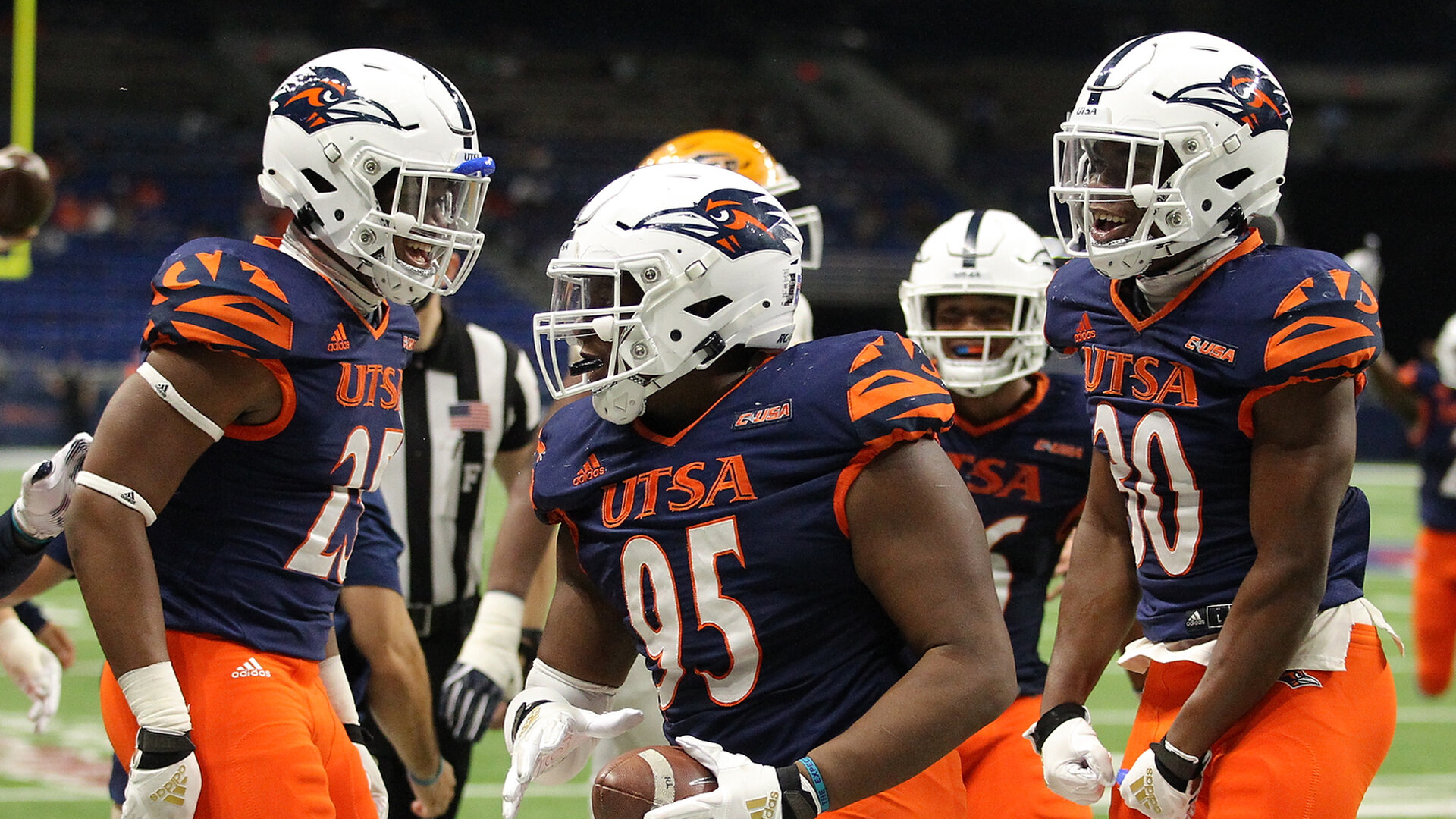
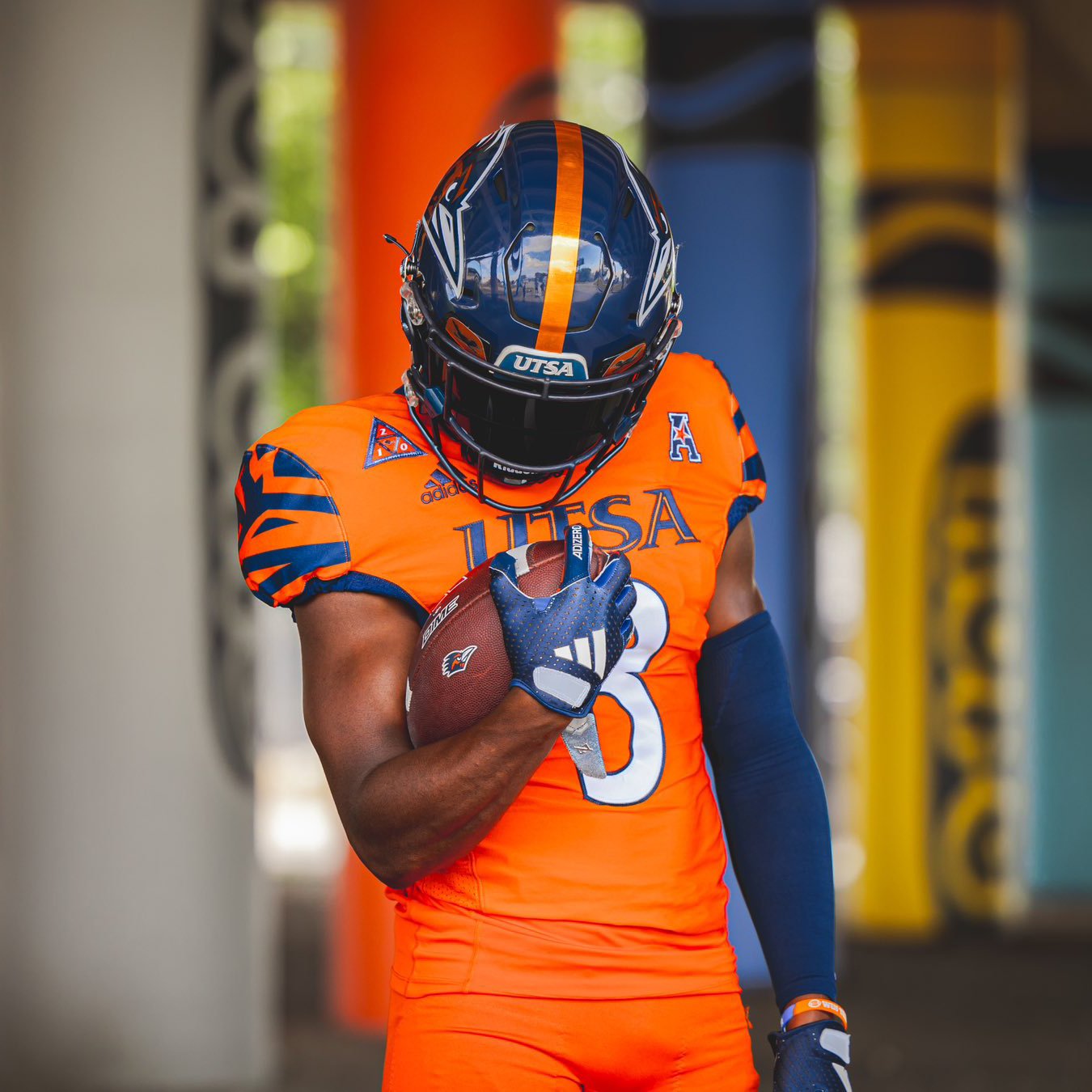
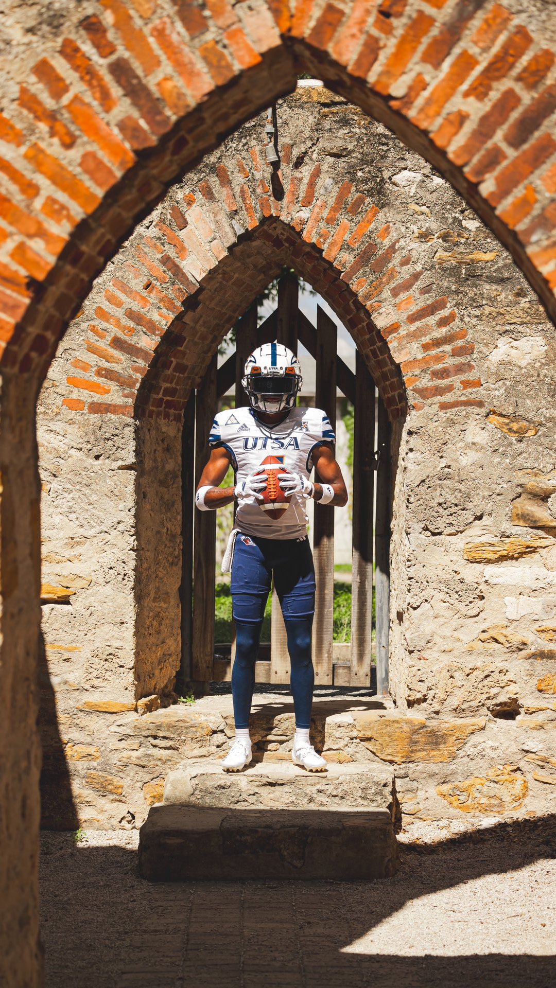
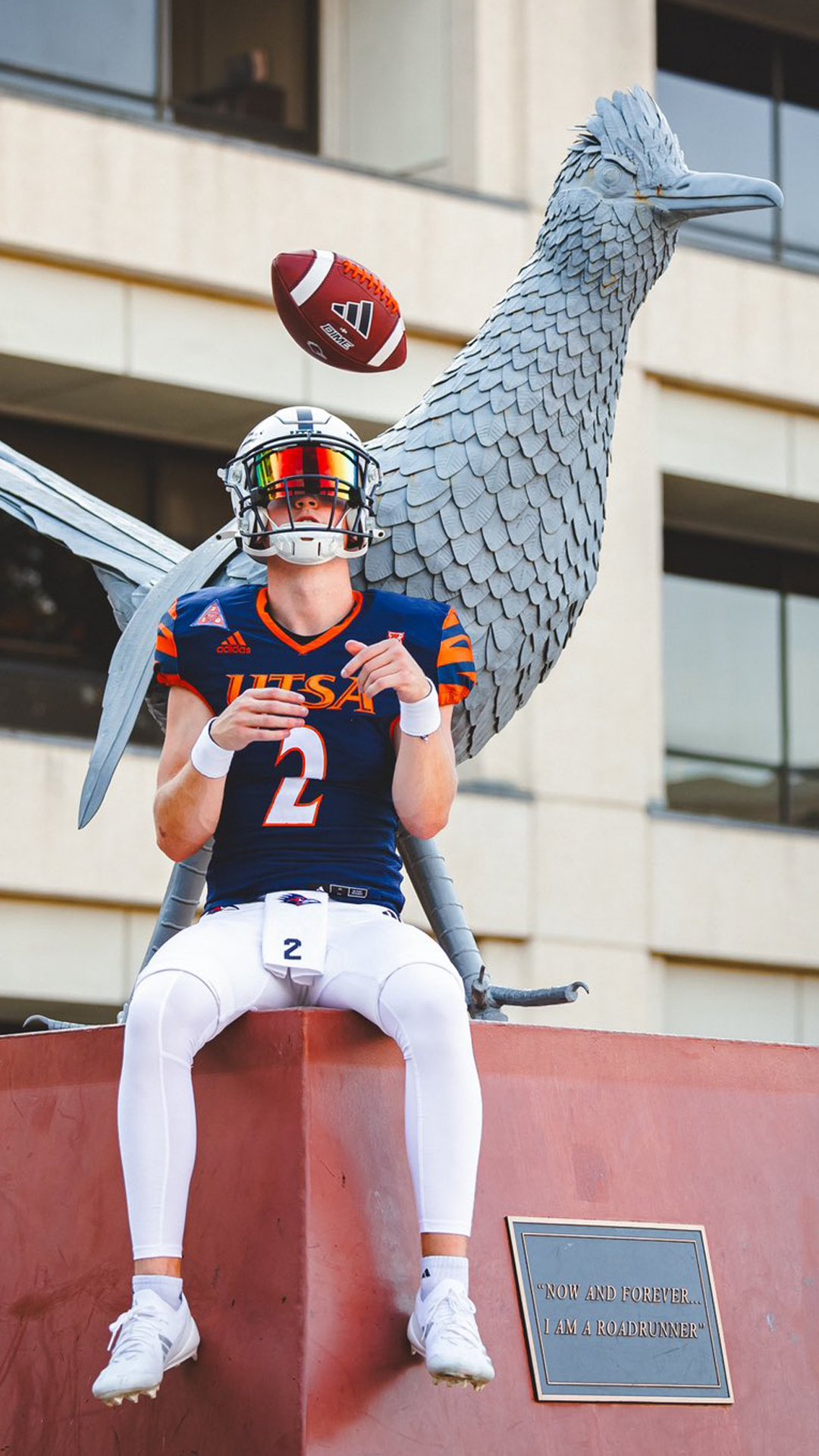
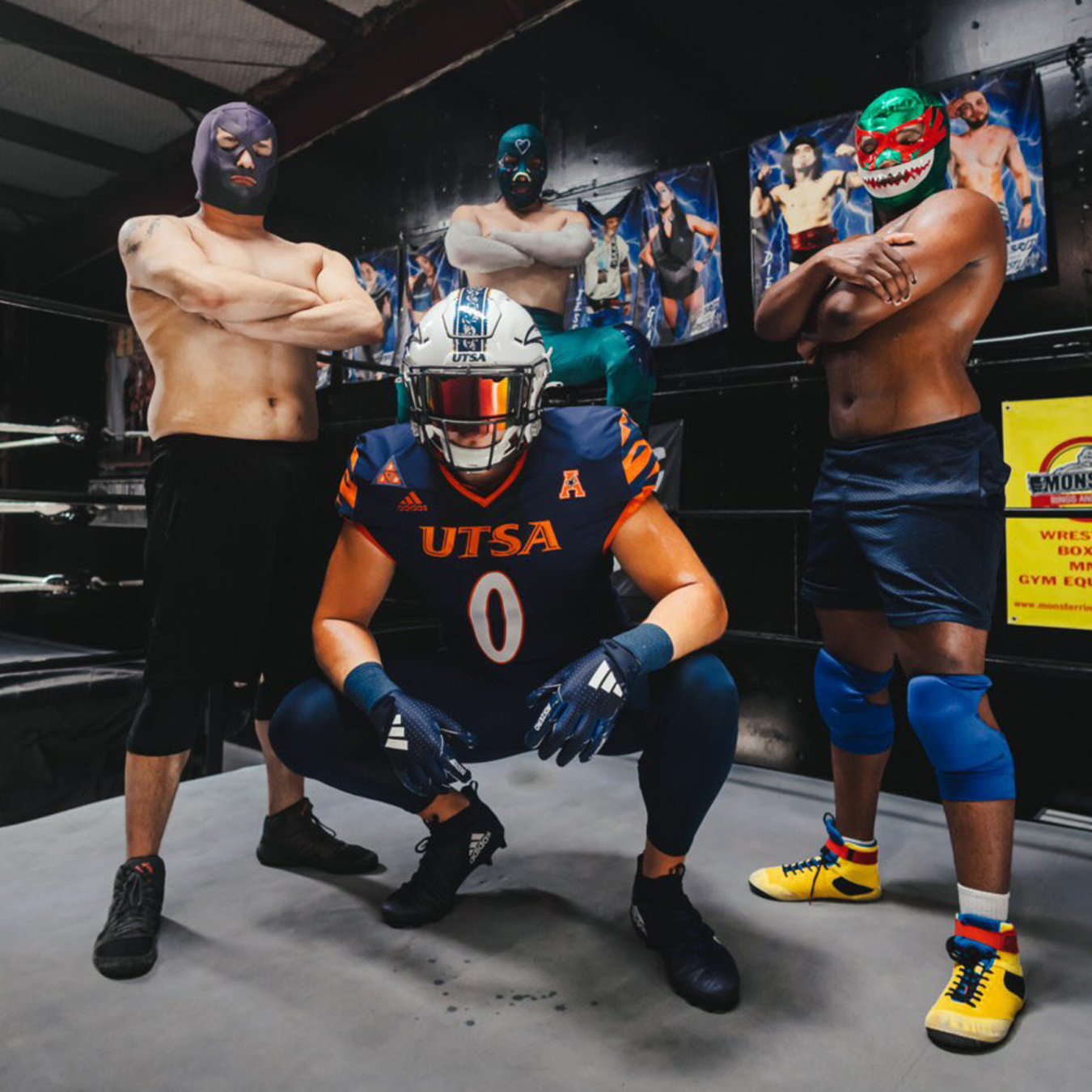
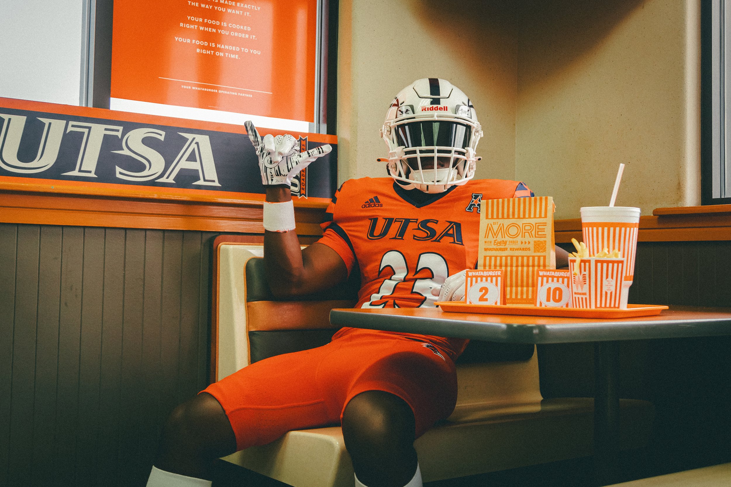
My main goal to update these uniforms to the proper branding identity. Finding the balance of keeping what our UTSA community is used to but also refreshing the style for new coaching era. The challenge was to update uniforms by modernizing & simplifying by utilizing our UTSA Athletics Branding Style. Below are previous uniforms that are now revamped to match current branding.
Portfolio Photos/Videos: UTSA Athletics
Uniform Photo: Jeff Huehn


Concept & Design
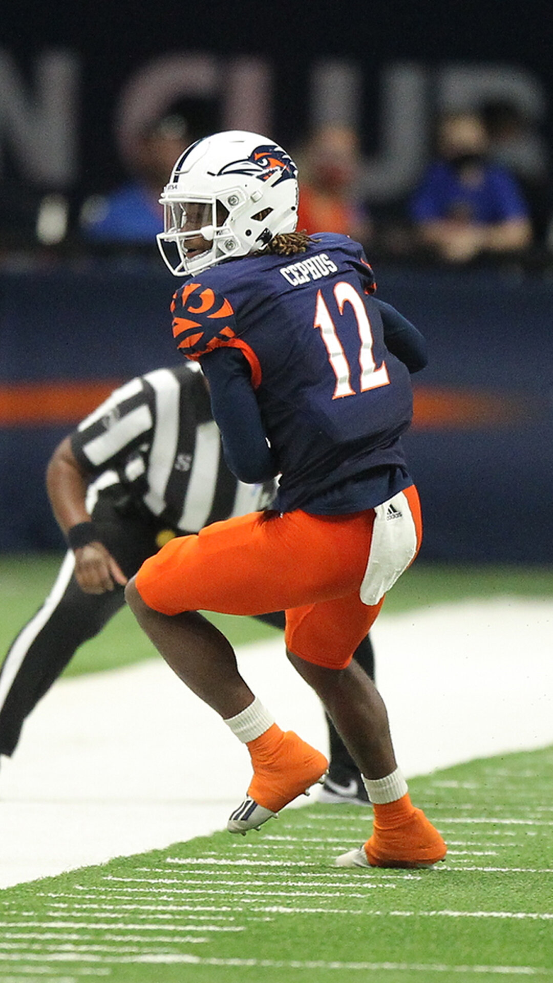
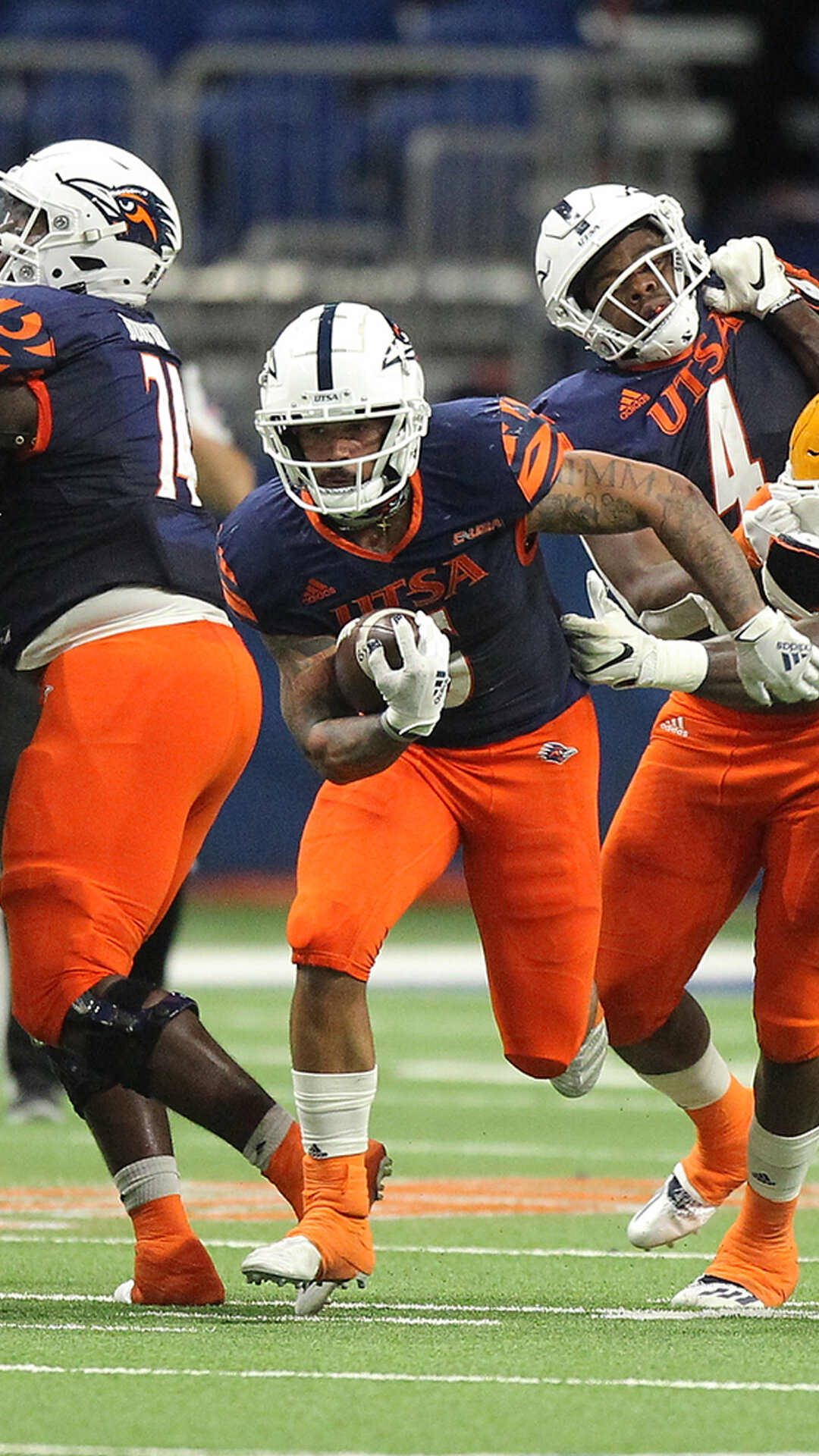
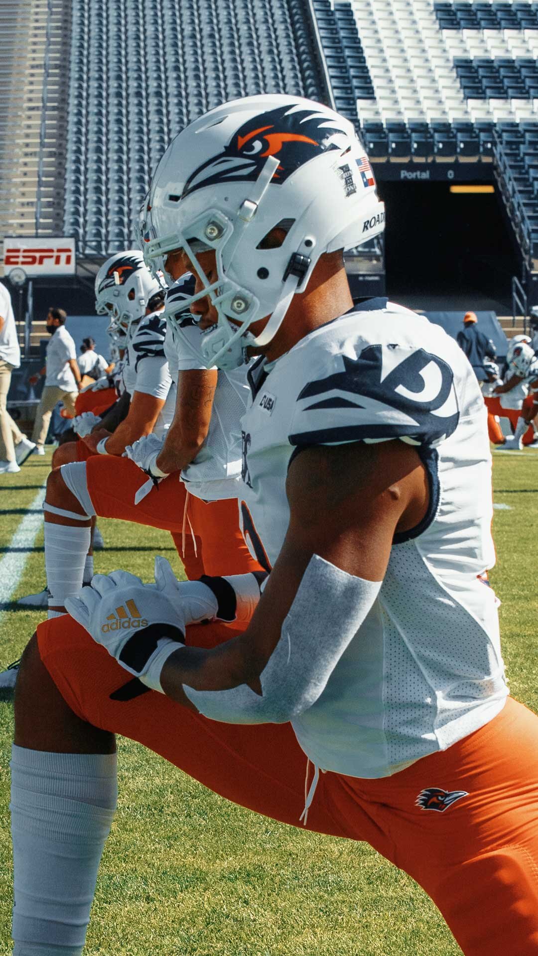
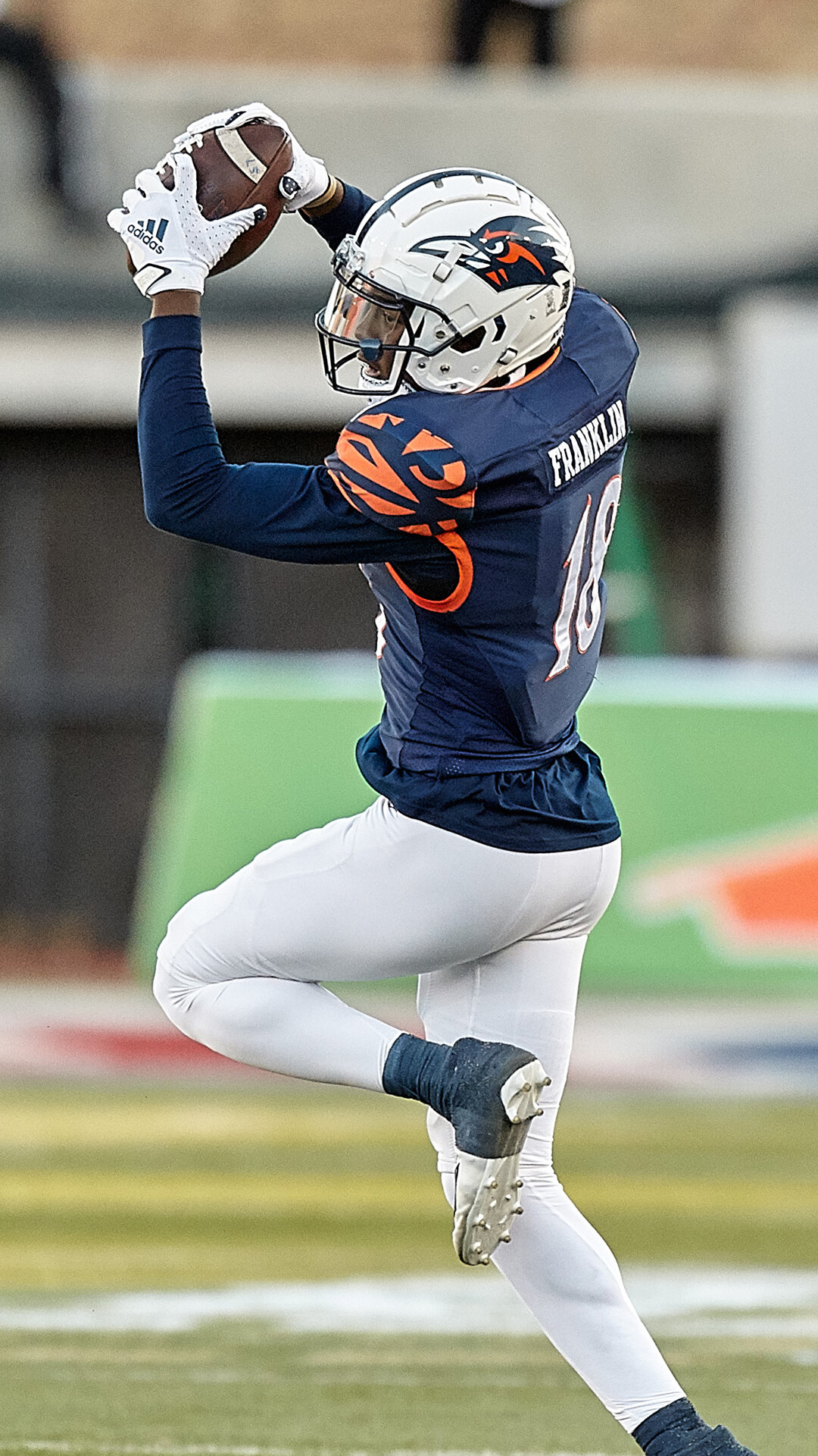
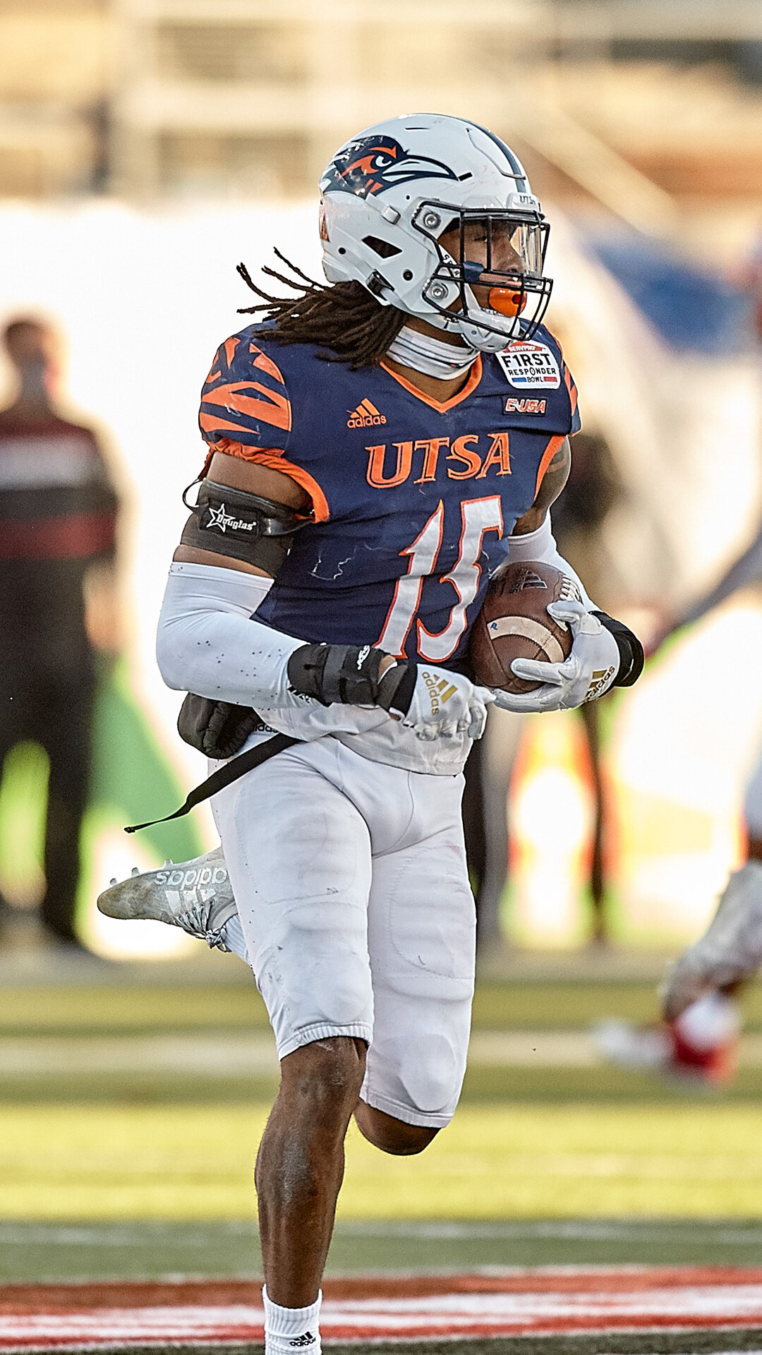
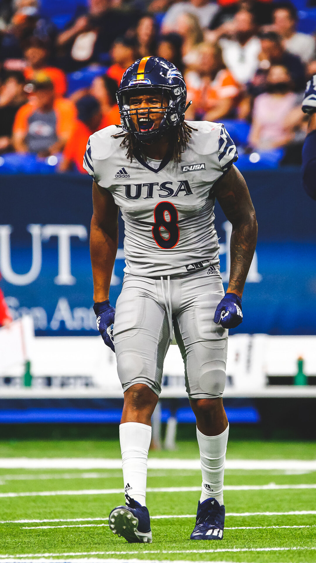
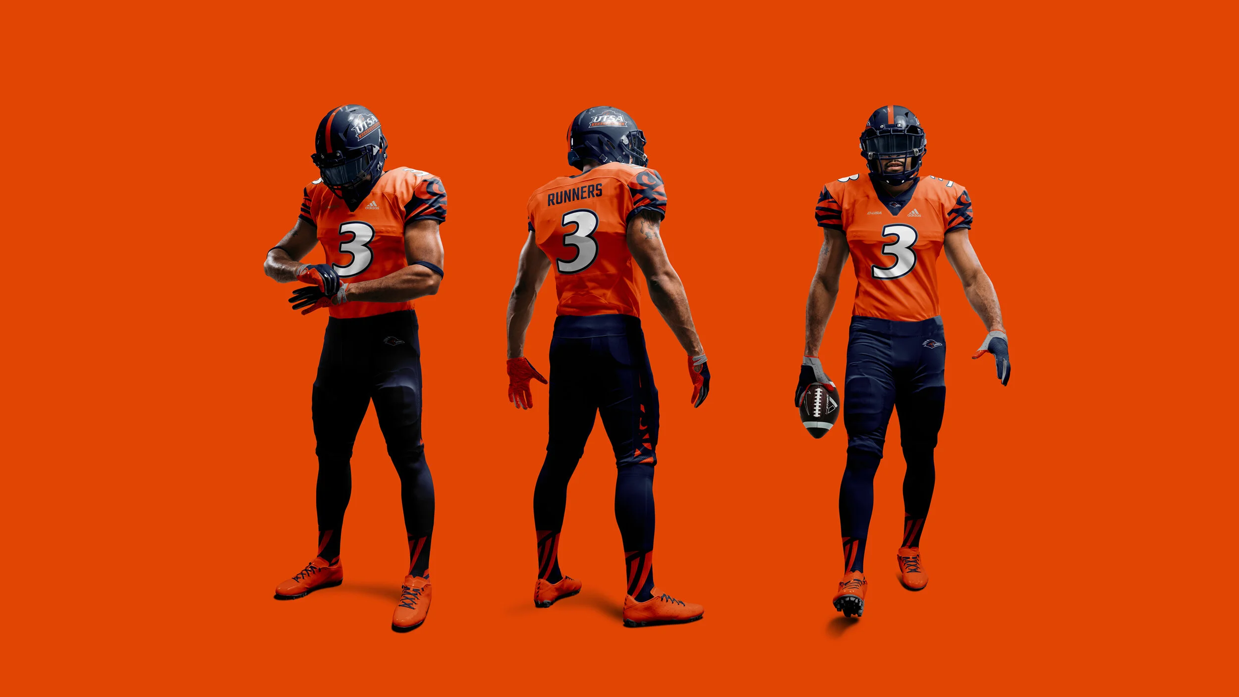
Adapted the number style to match current UTSA Athletics’ font in bold. Also, untilized the proper logos for specific areas of the uniform. Once foundation was set with primary university colors, fonts, and branding I was able to expand it & create variations.



Outcome
Through working with UTSA Equipment, modifications were made to the original concepts to adhere to proper protocols. Within our limitations we were able to work together to update the branding elements as well as add some style of our own.
Thankfully, these uniform designs have gotten some great feedback from not only our staff but also our students & community. The impact of these refreshed uniforms have given this coaching staff an identity while giving the UTSA community a new buzz with content such as hype video and uniform reveals for social media.
Reveal Photos: Joshua Guerra/UTSA Football
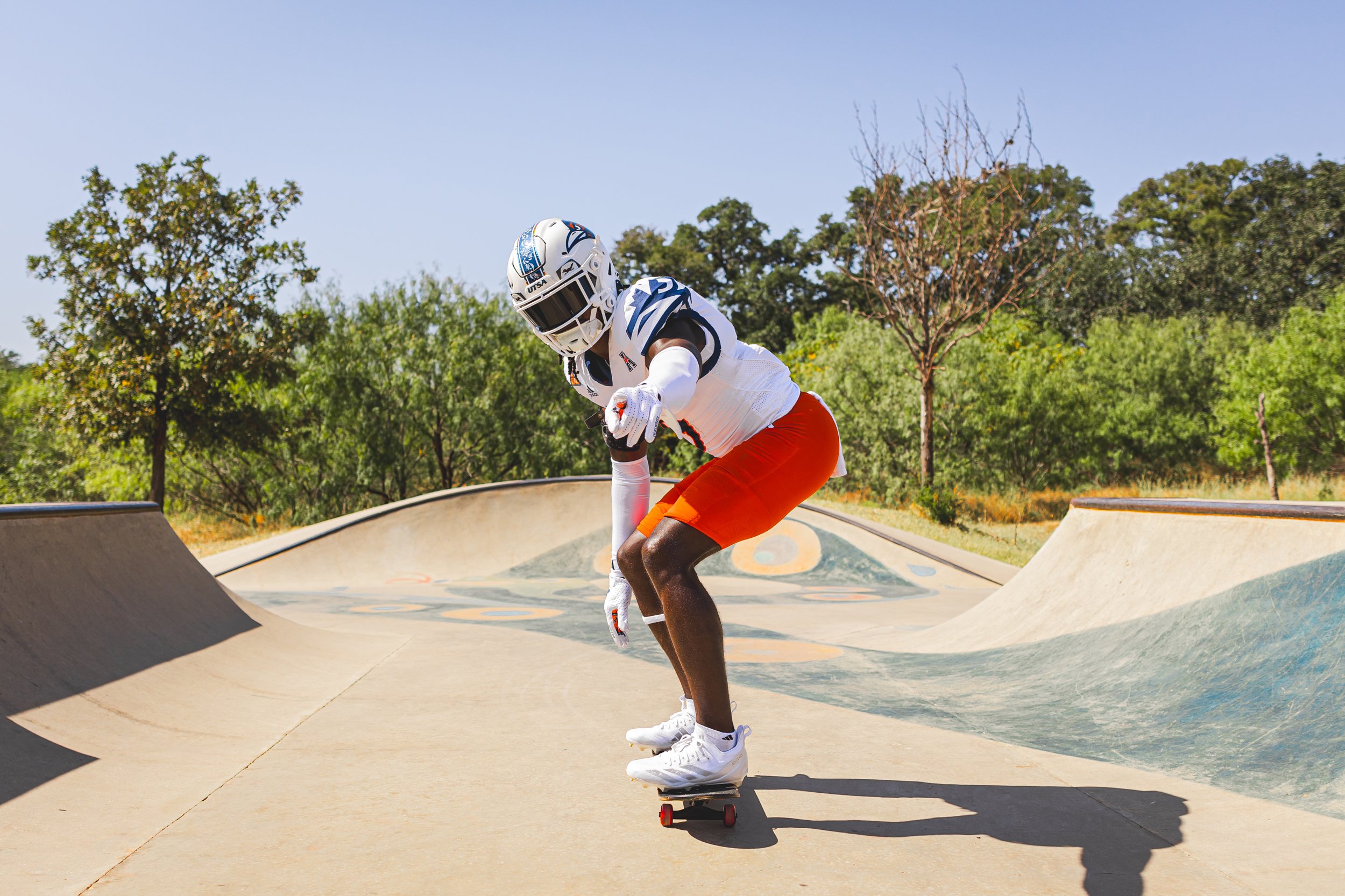
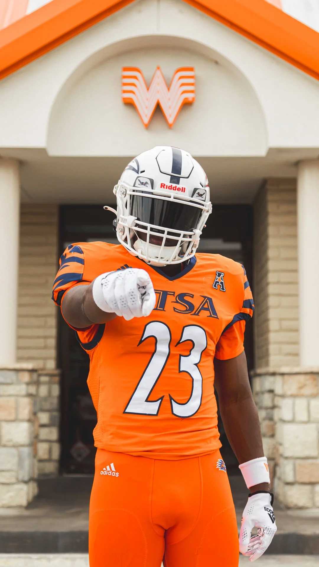

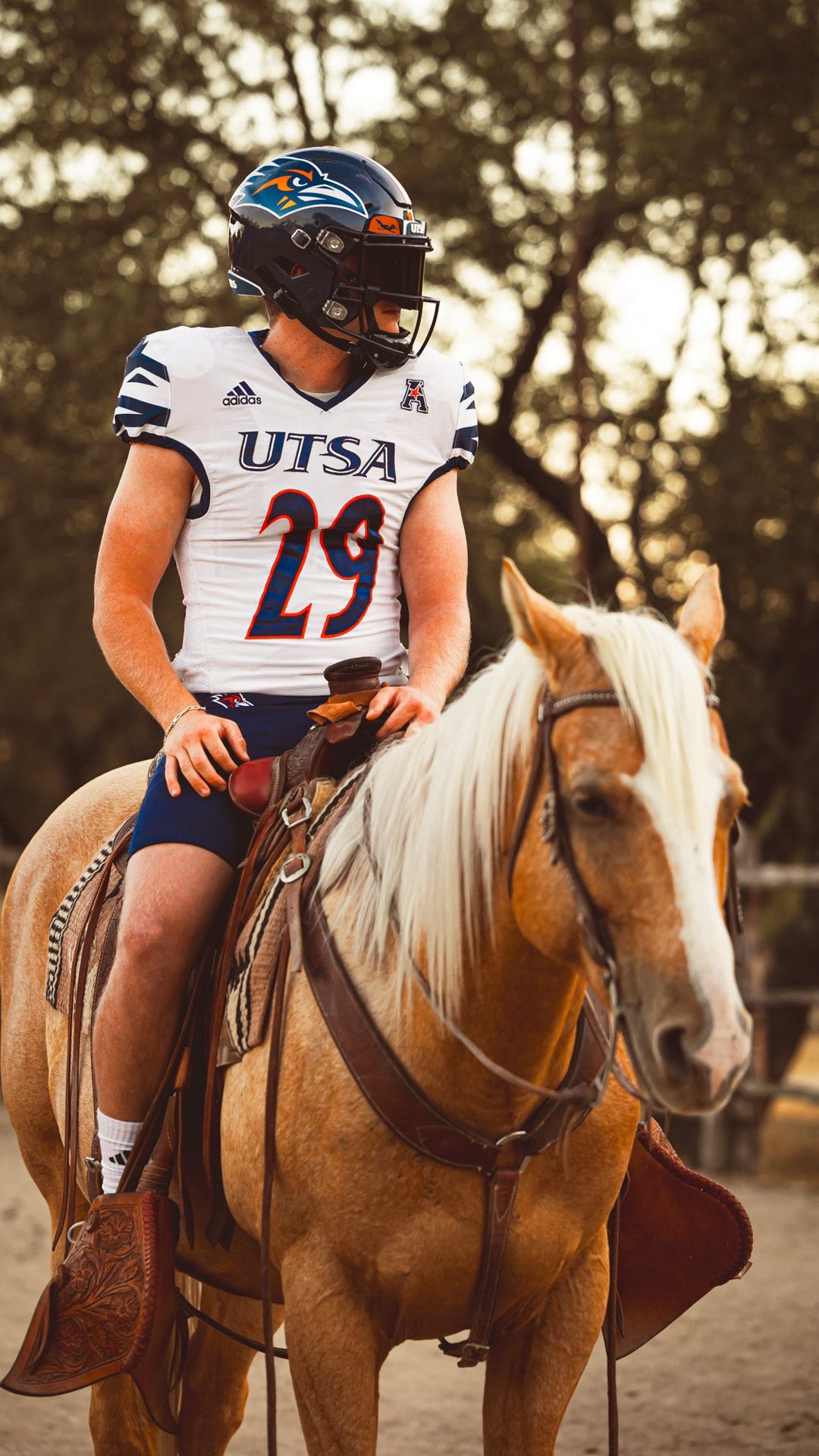
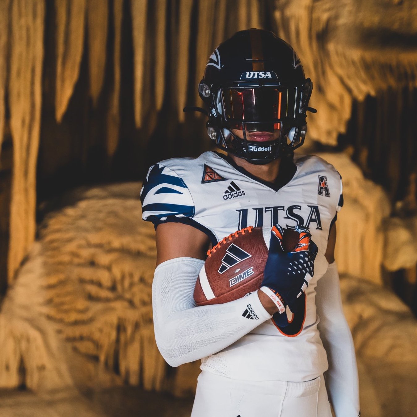
In-game details
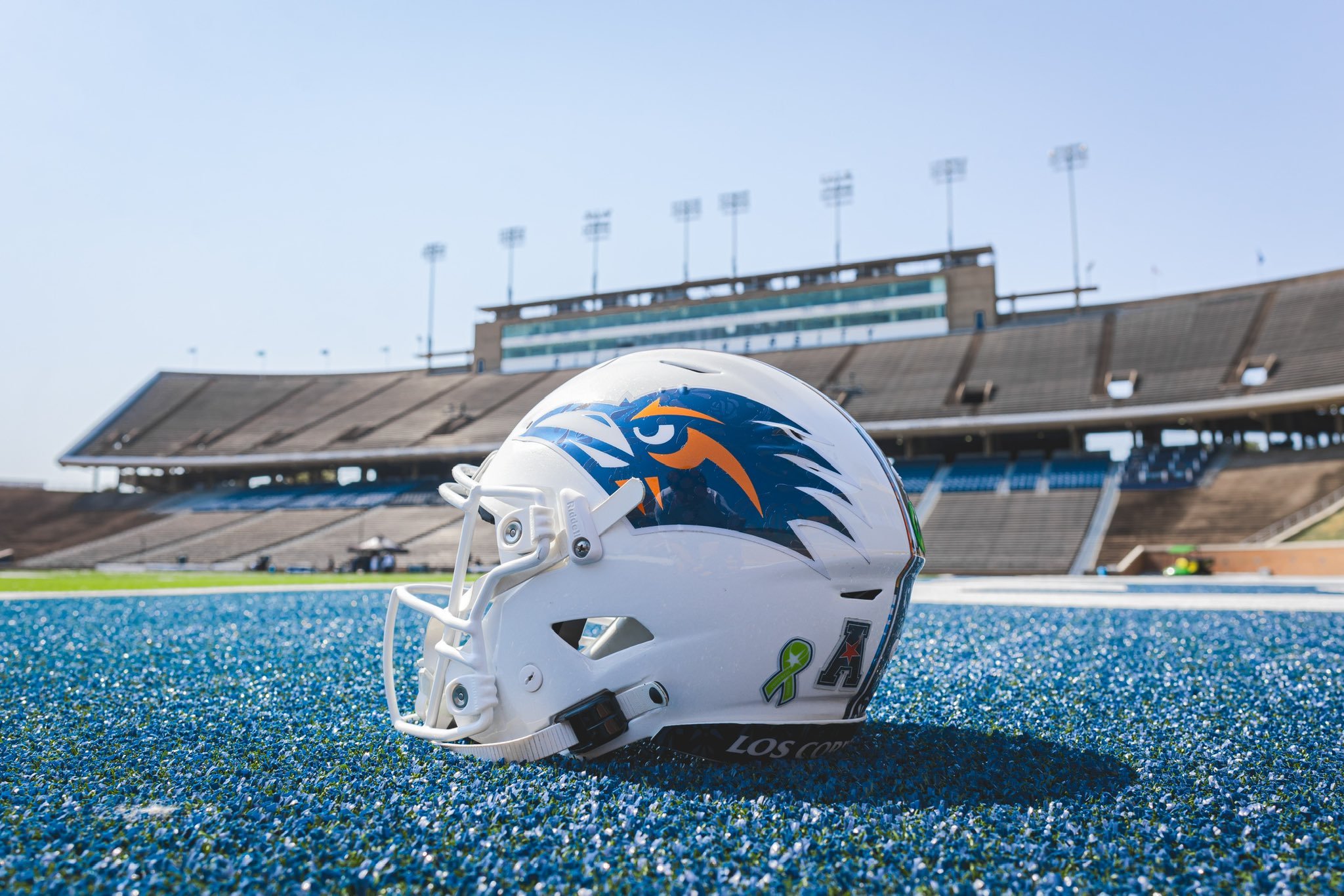
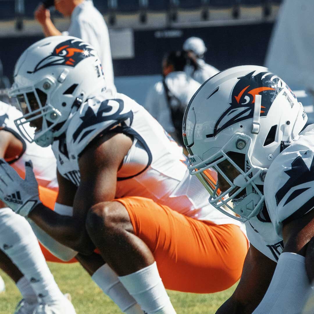
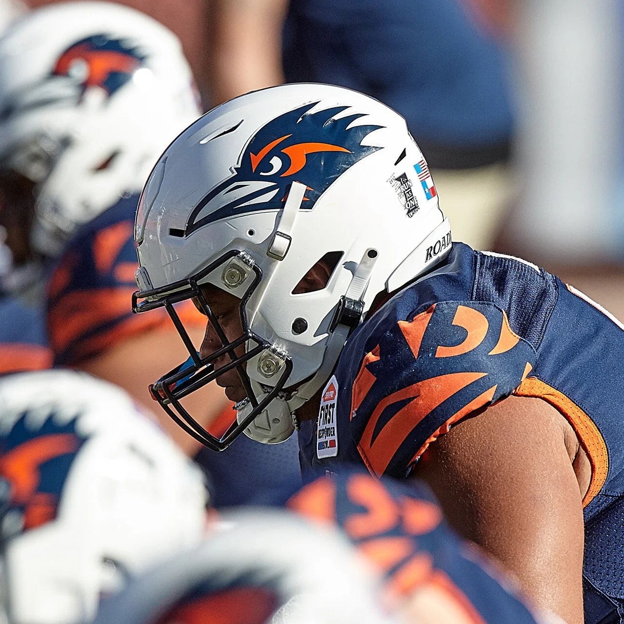
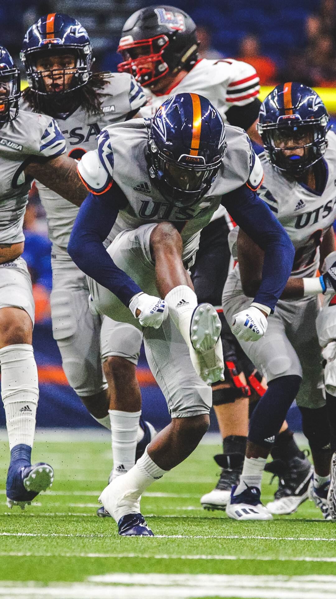
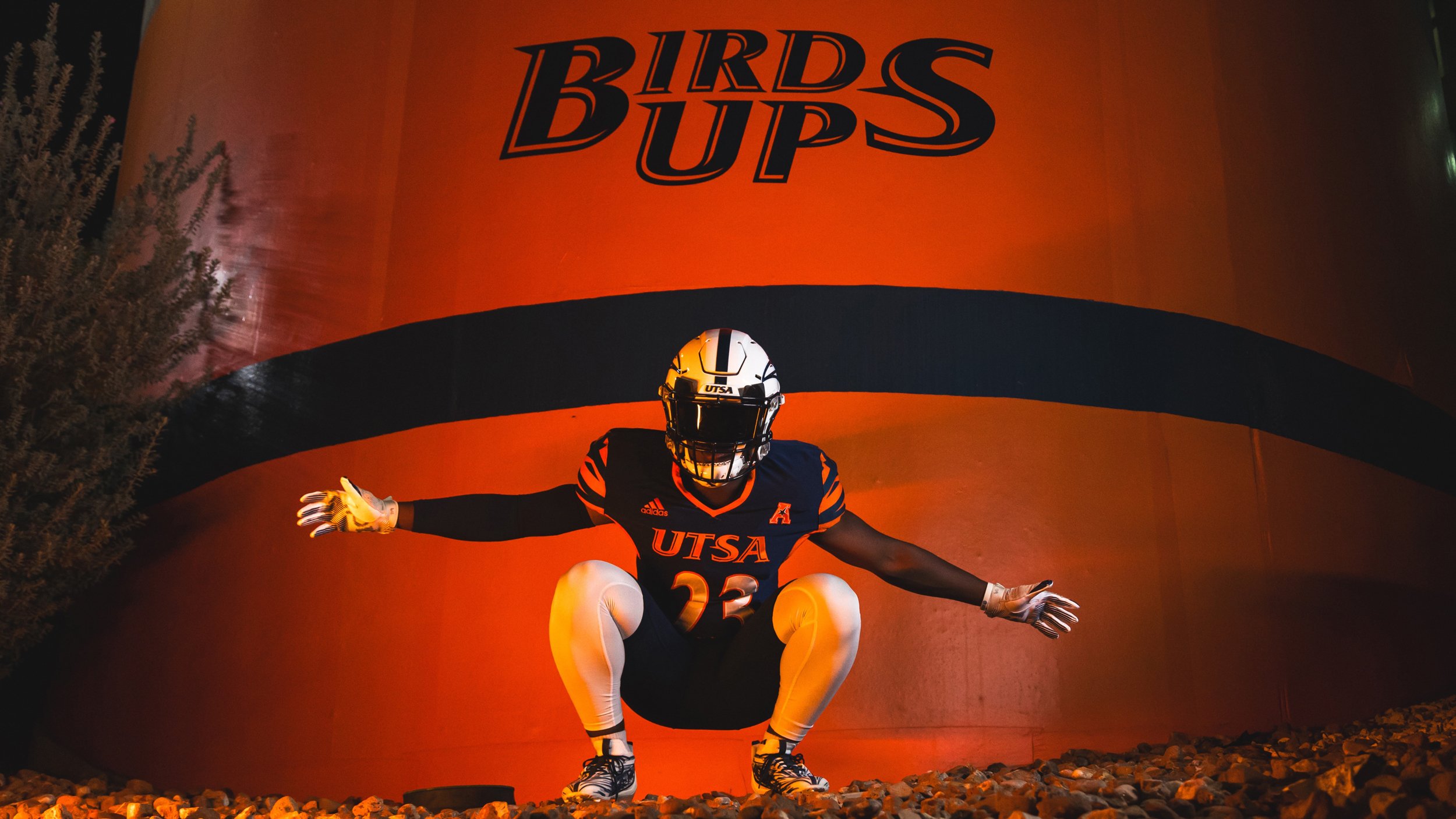
It started with updating the helmets with proper Roadrunner logo leading to having different variations of colors ways utilized during in-game experience. Updates have been made as UTSA Athletics has transitioned to the American Conference.
Photos: UTSA Football/Athletics

