UTSA Convo
Court
Branding & Court Design
overview
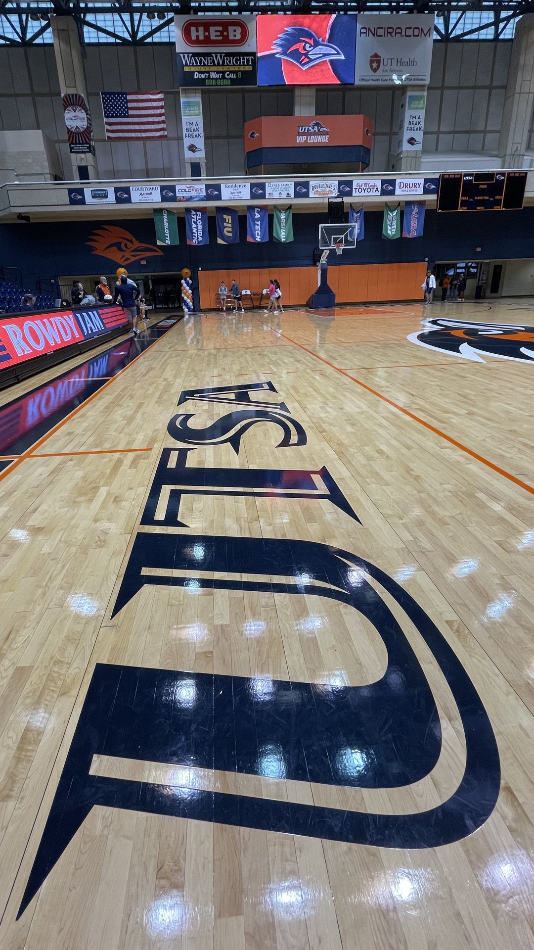
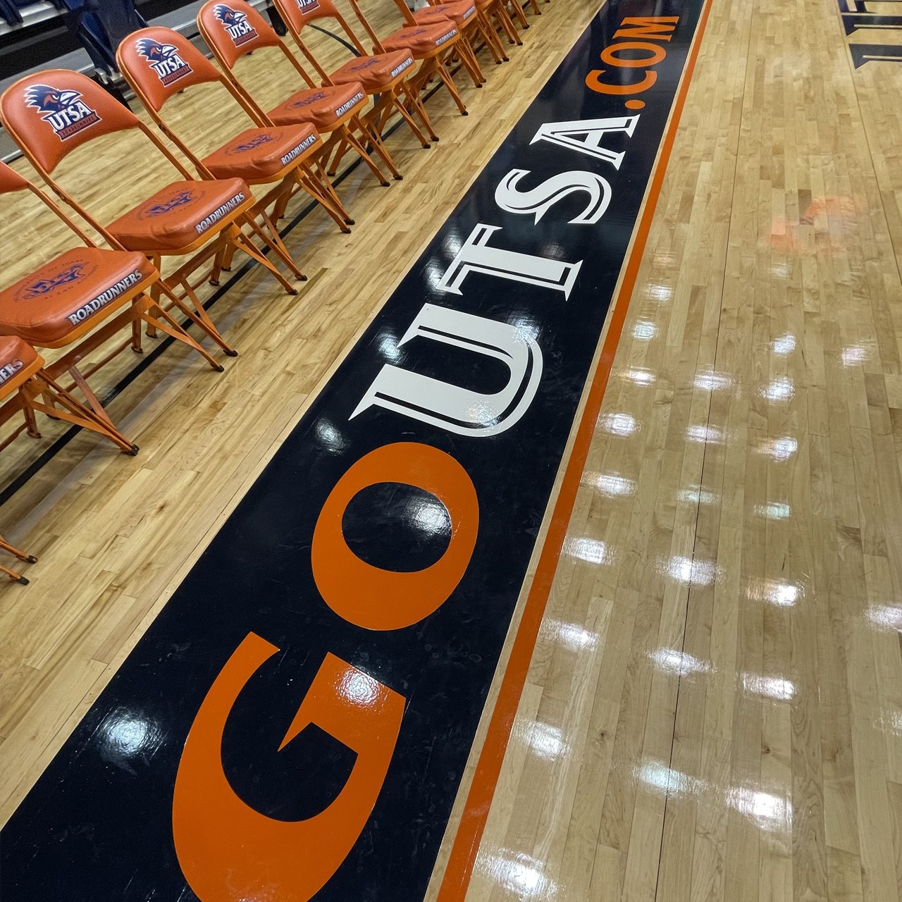
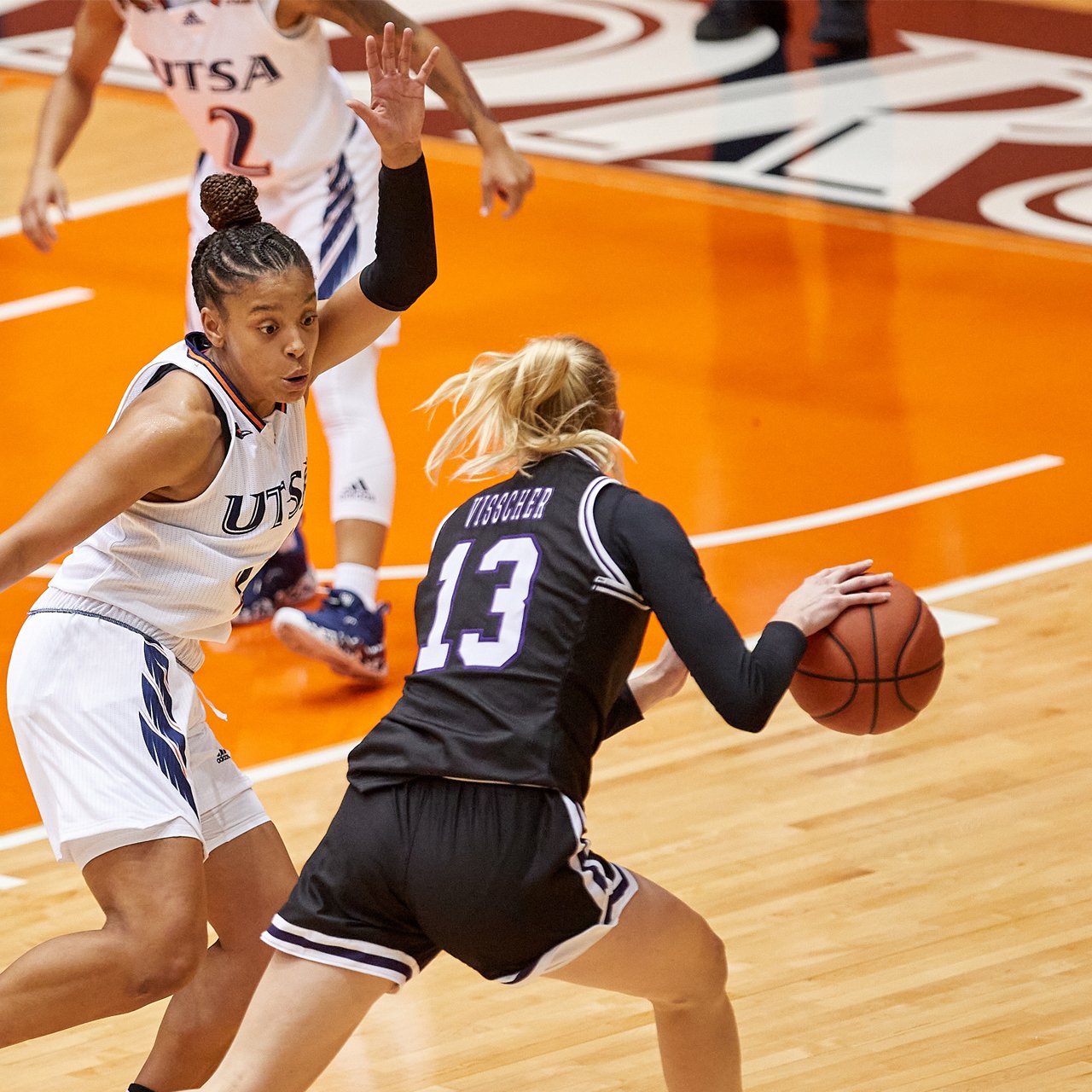
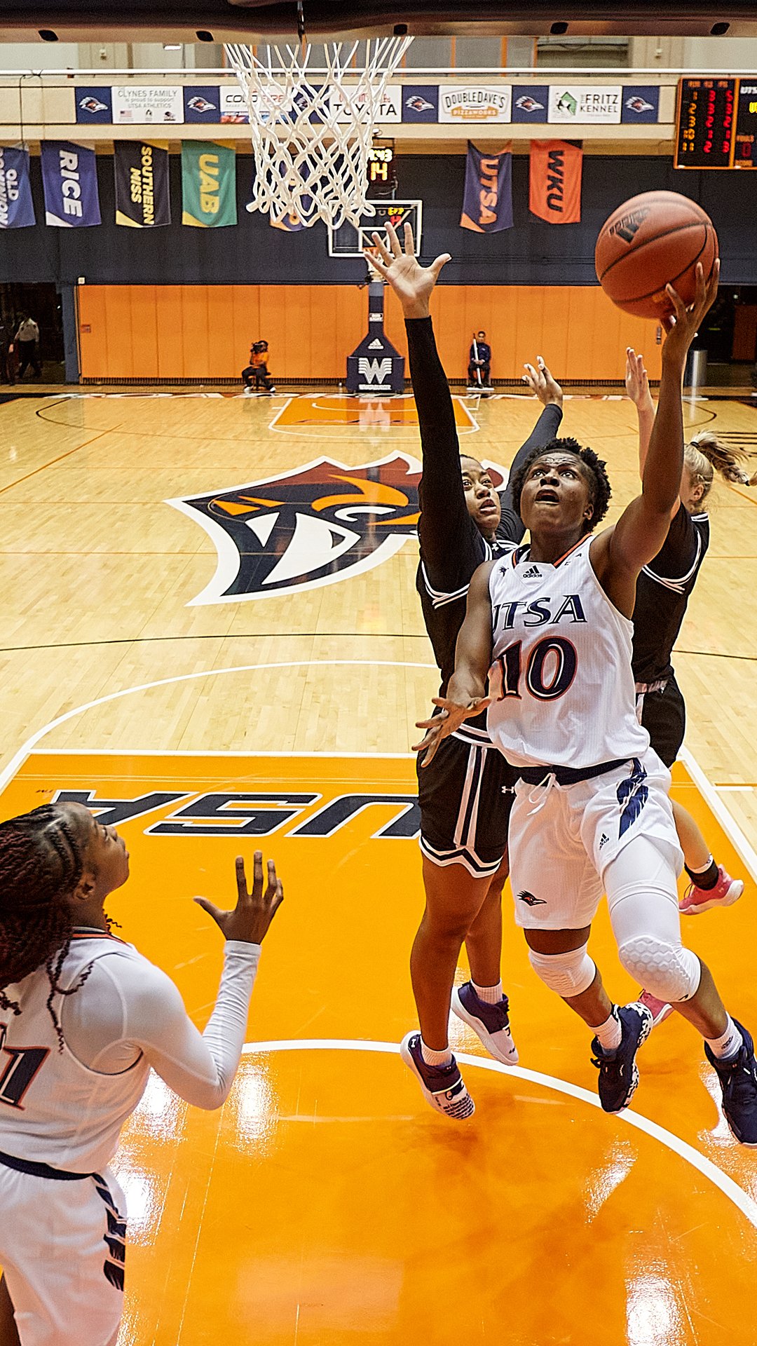
Redesigning the court for Convocation Center was one of my top list goals when I joined the UTSA Roadrunners’ family. Personally, as a big fan of basketball I was so happy to be able to work on this and implement the proper branding from our current standards we have been establishing.
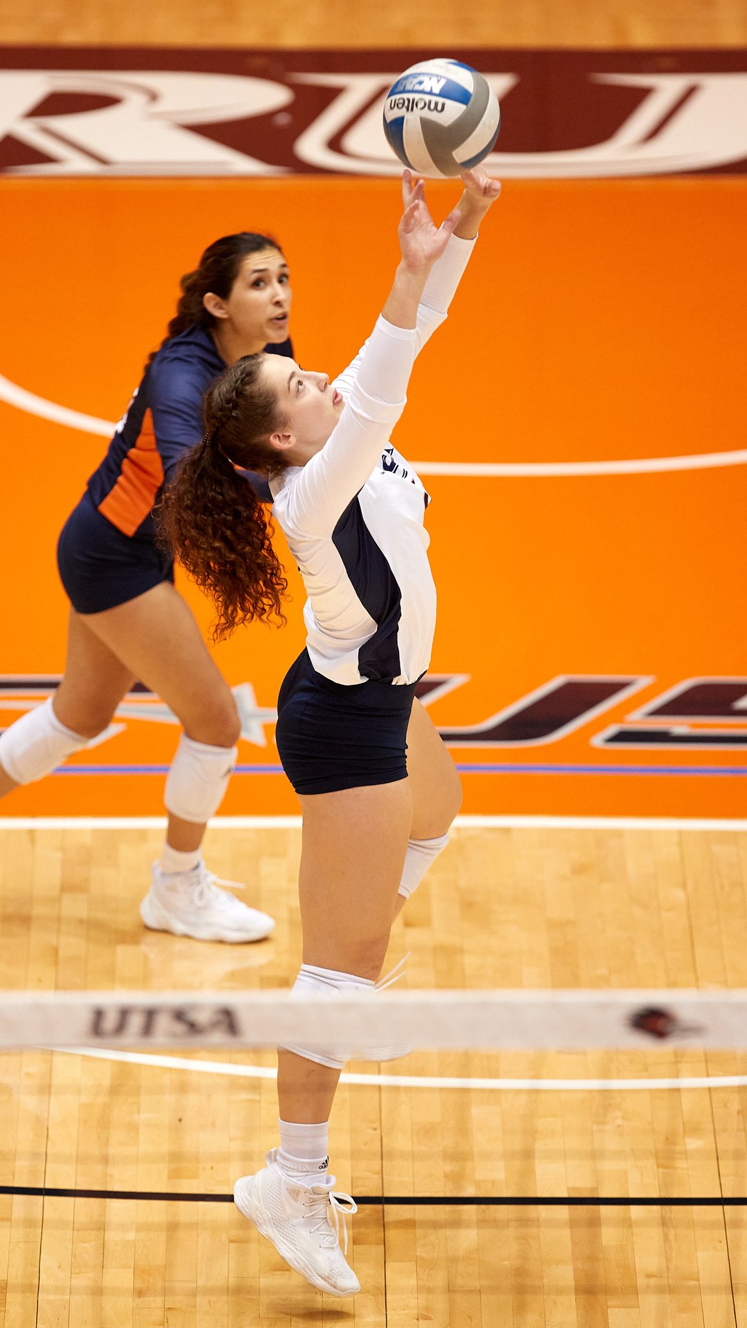
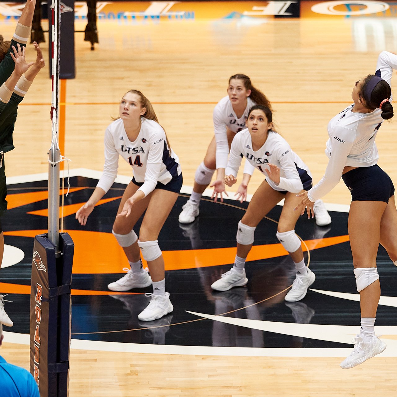
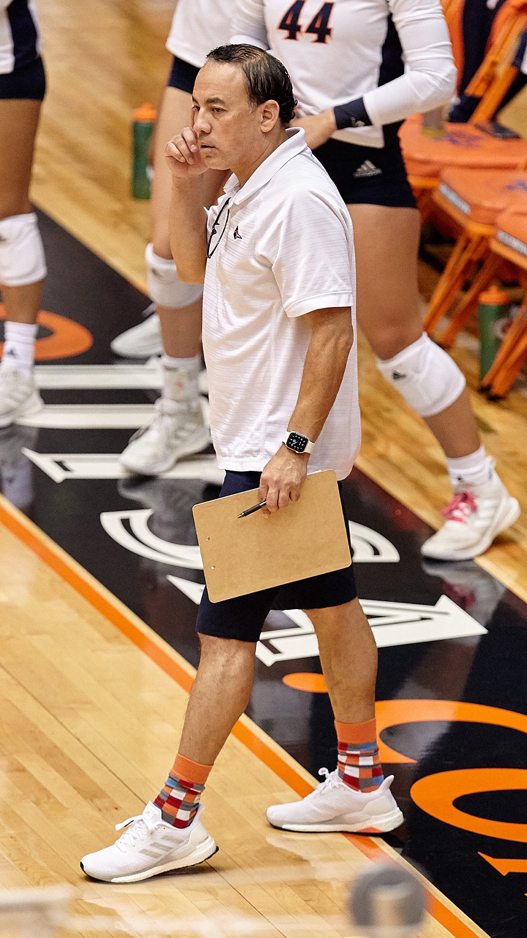
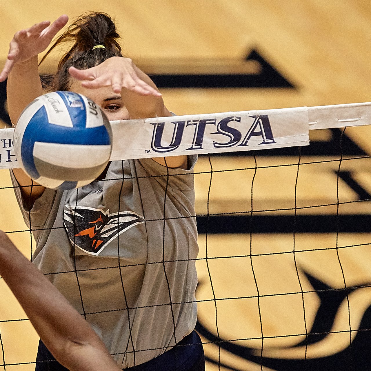
The main challenge was to bring the new court design to our current branding standards. Working with Facilities and a set budget to execute what we could within a tight timeframe. The Convocation Center is a much older venue that looks outdated in a lot of areas, so to update the court was it’s own challenge to figure out within space and layout given. Also had to be design friendly for the use of Volleyball when switching back and forth between games.
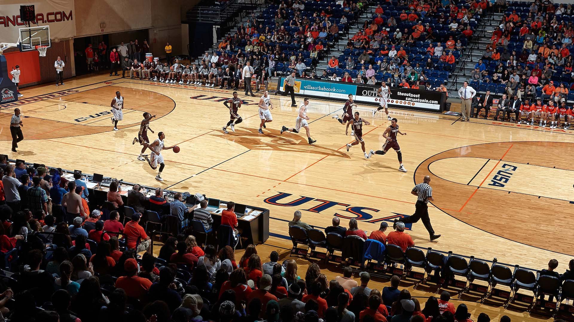
Here are some examples of what previous court designs have been through out the years.
Photos: Jeff Huehn/UTSA Athletics


Concept & Design
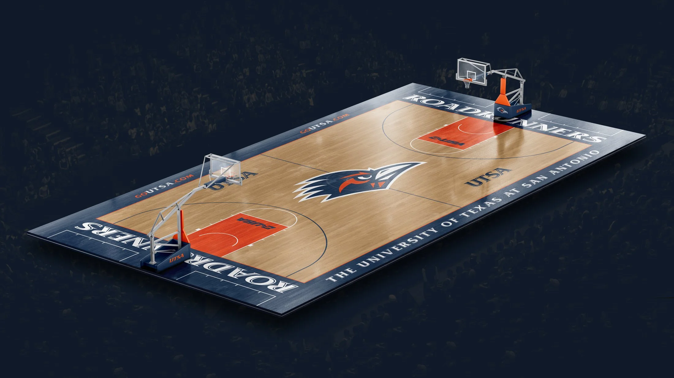
Working with Facilities Director I was able to put together a design concept to present to our higher ups showcasing an updated court. My main focus was branding and making sure all the proper logos and typography was used. Also, to try to make it as colorful and bold as possible within our budget to stand out with our UTSA Spirit. Overall, wanted to look sharp and clean to not only look good in person but also present well from a broadcast perspective. How work is presented is so key in showing others your vision and it helped to put a realistic mock up as well as a flat layout so they can see exactly where elements are going. After it was approved, my job was to package all these elements from logos to type so it can be referenced when applying to the actual floor.

Outcome
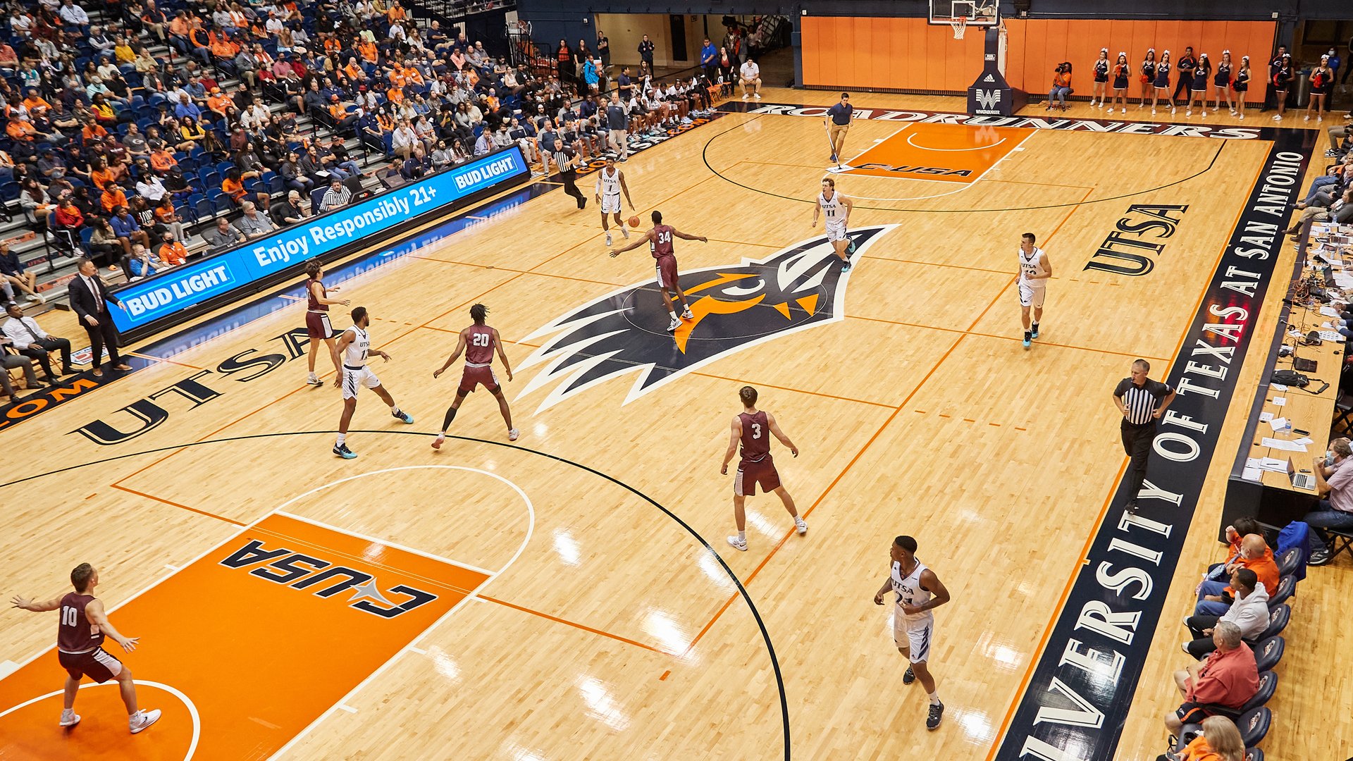
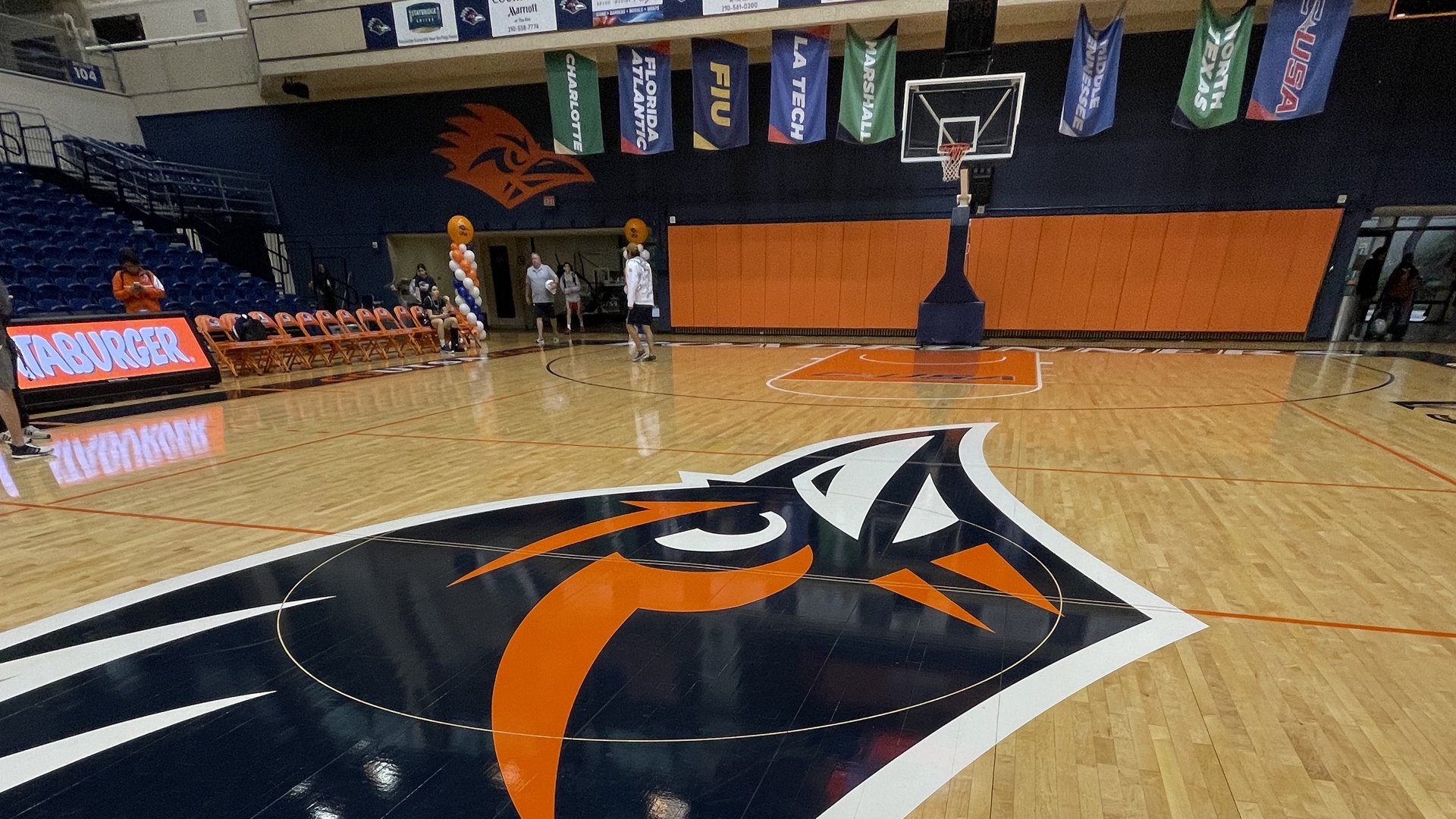
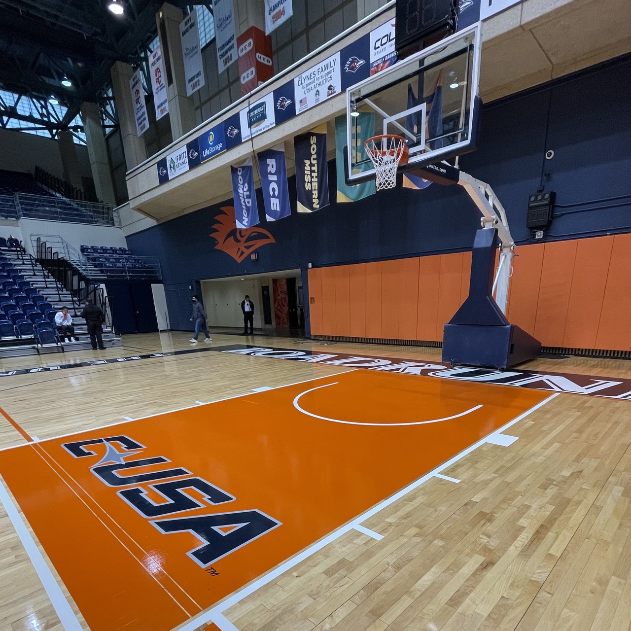
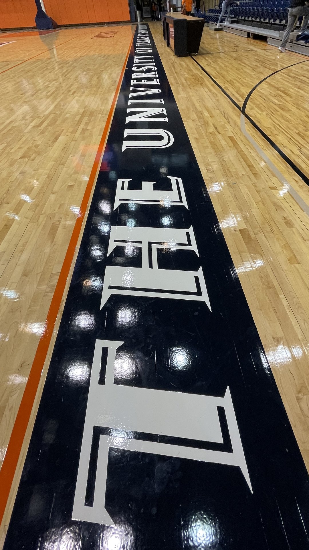
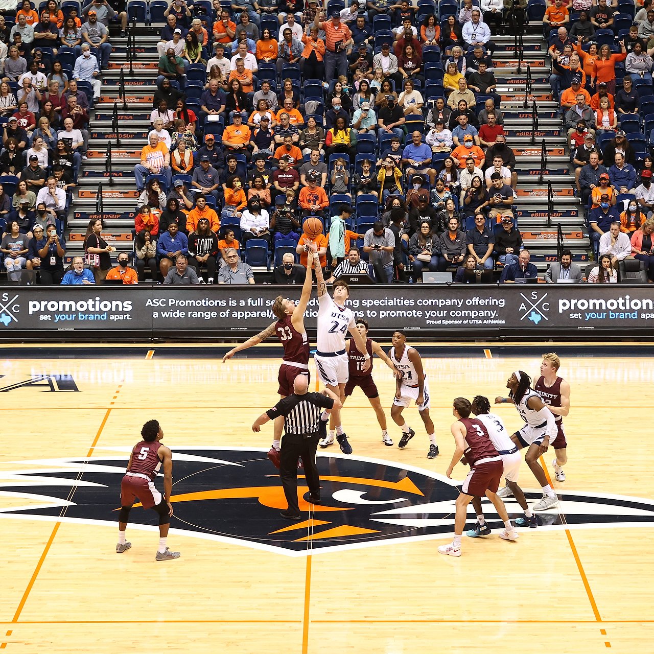
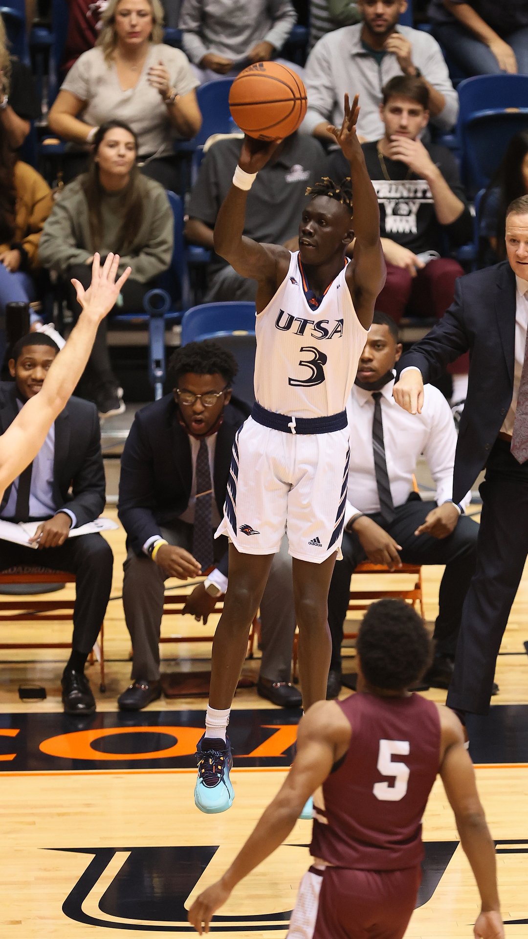
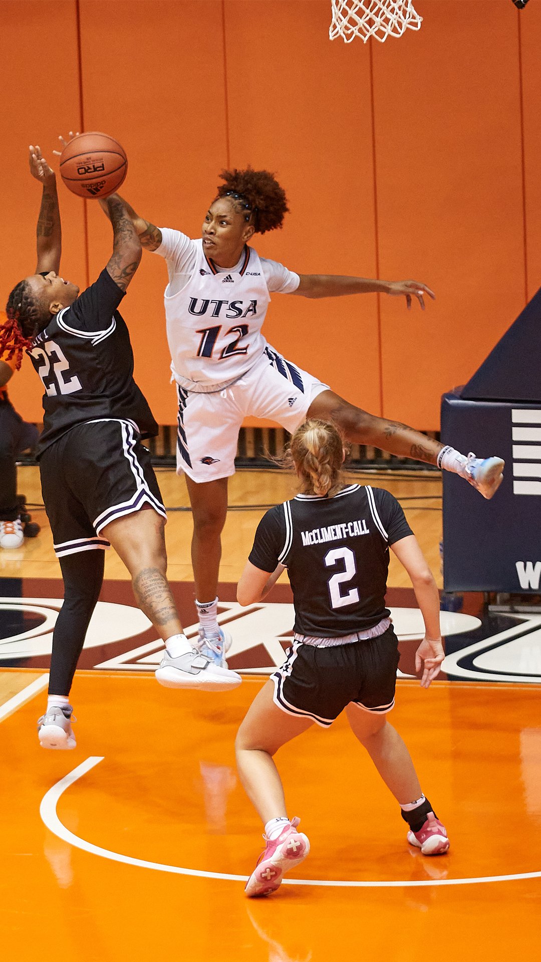
The new court design has helped enhance the overall aesthetics of the venue by bringing it to our current branding standards. It gives a consistency for all sports that play on this court and brings our UTSA Spirit to the forefront for our fans to enjoy.
Videos/Photos: UTSA Athletics


