UTSA Convo Banners
Branding & Banner Design
overview
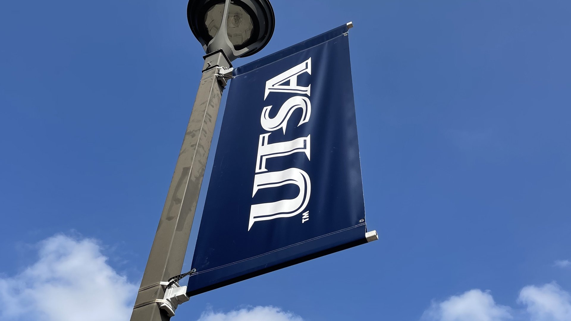
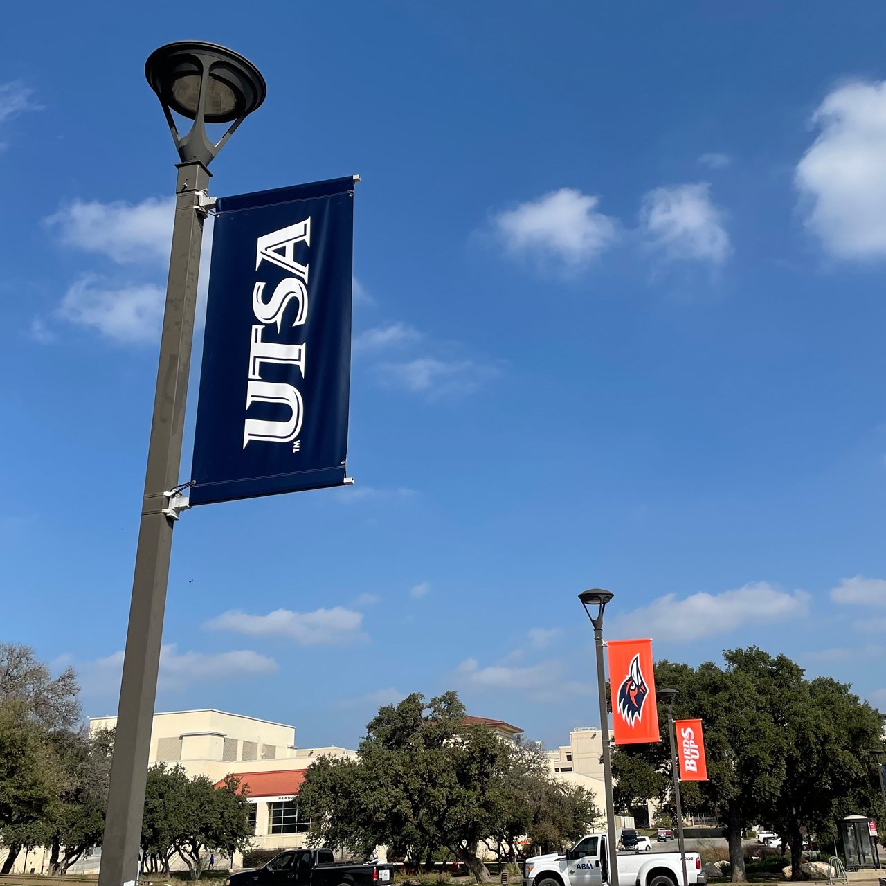
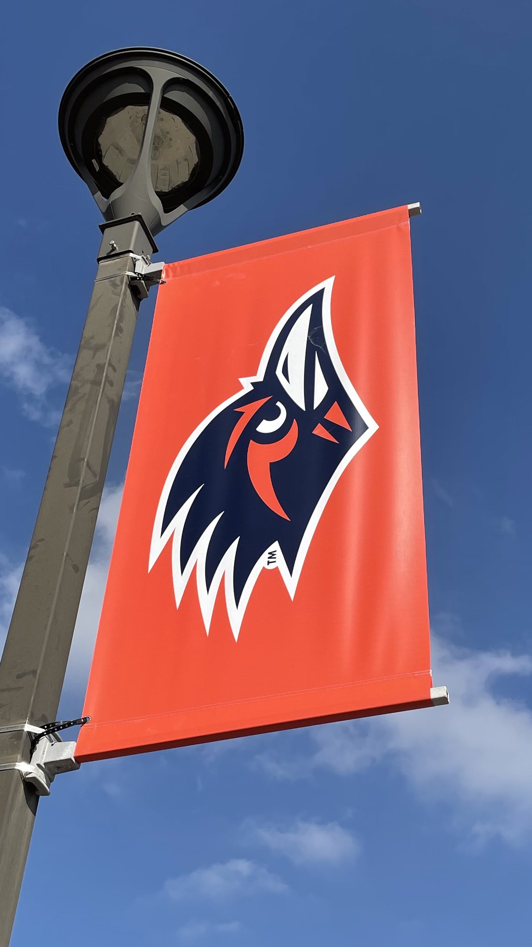
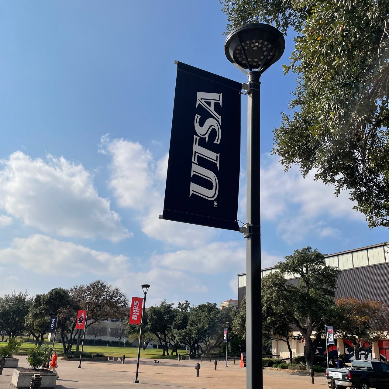
This was a big project that was done in collaboration with the university to update the banners in front of the convocation center where basketball and volleyball play. One of my favorite projects to do as this is one that is more of timeless project that is meant to last a long time for our athletics program. A great opportunity to showcase more of our latest branding standards within our campus.
The challenge was to revamp what was previously done before which was using banners showcasing players of each sport. The problem with this solution was it becomes outdated very quickly and when dealing with tight budgets, it’s not the best in the long run to do. Below is a snapshot of what the banners in front of the convocation looked like before the redesign.

Concept & Design
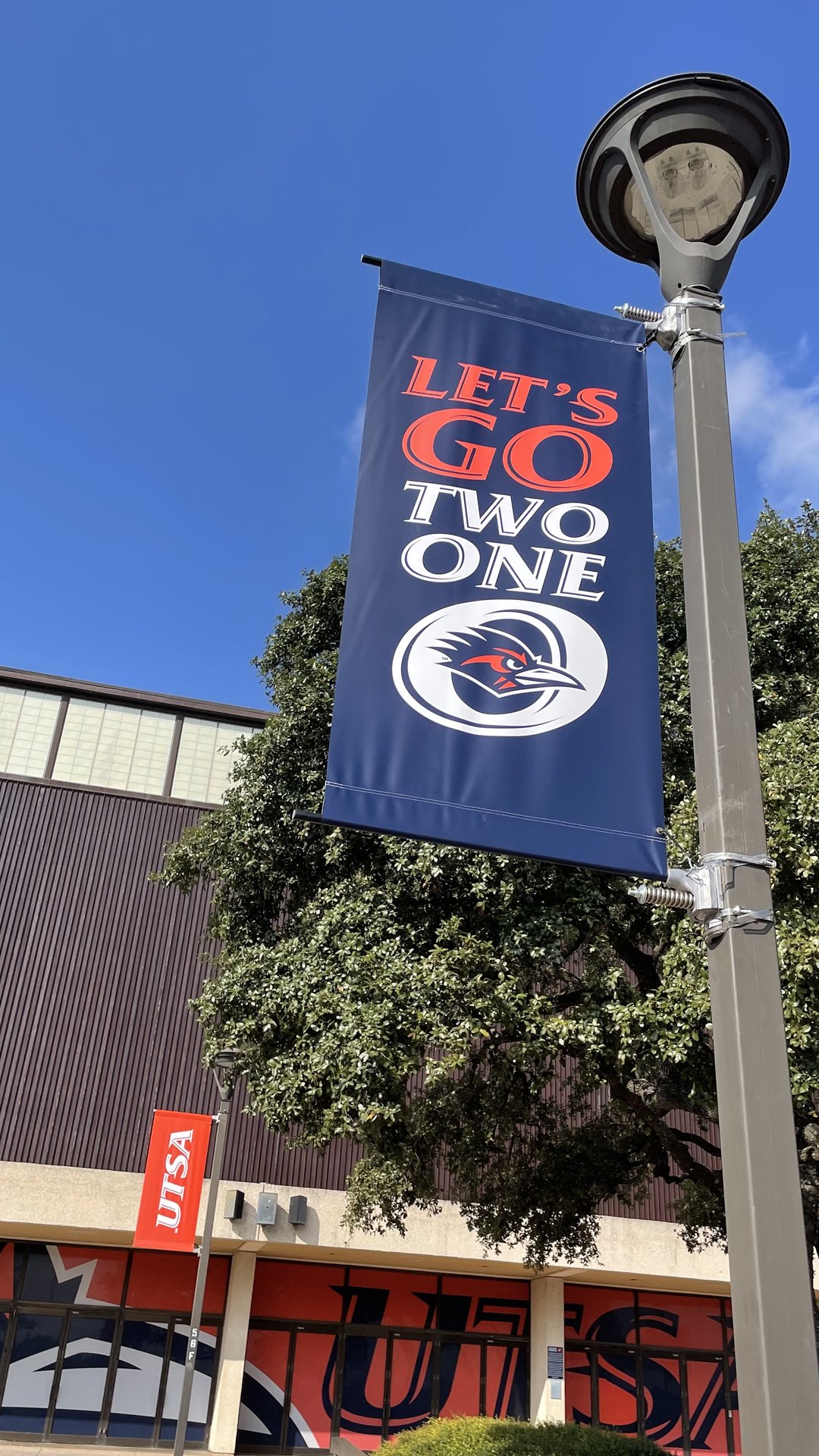
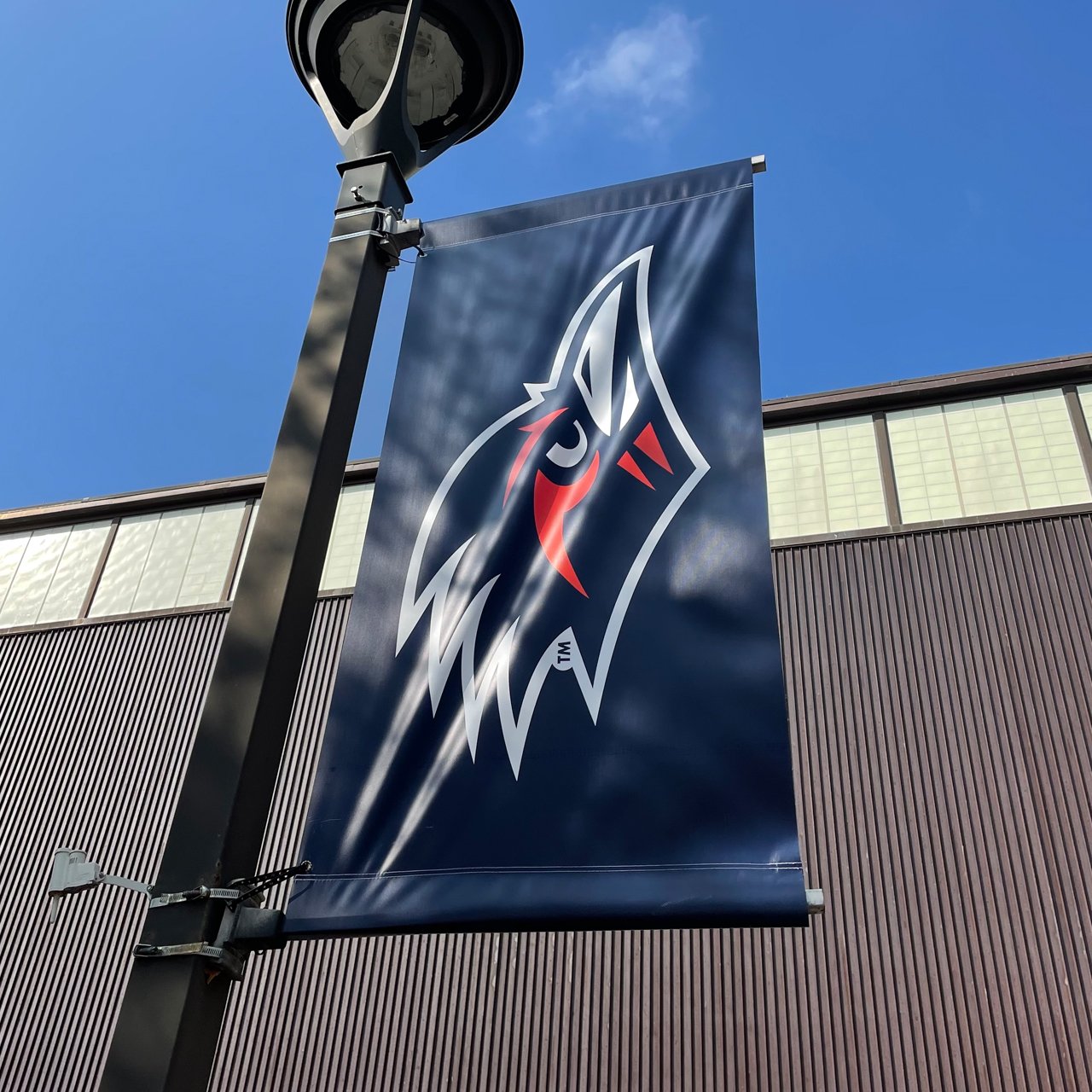
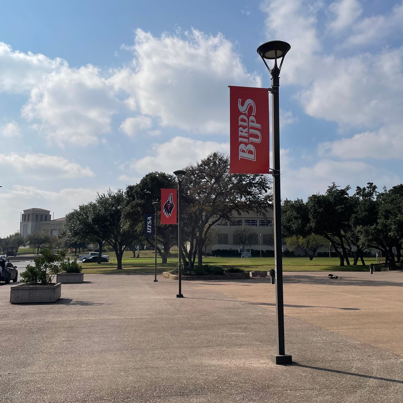
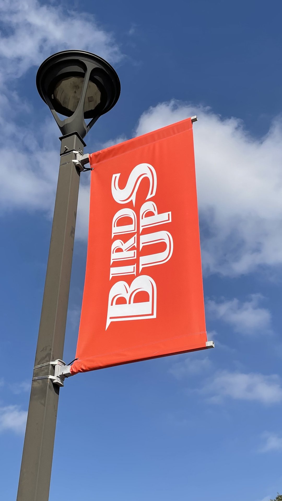
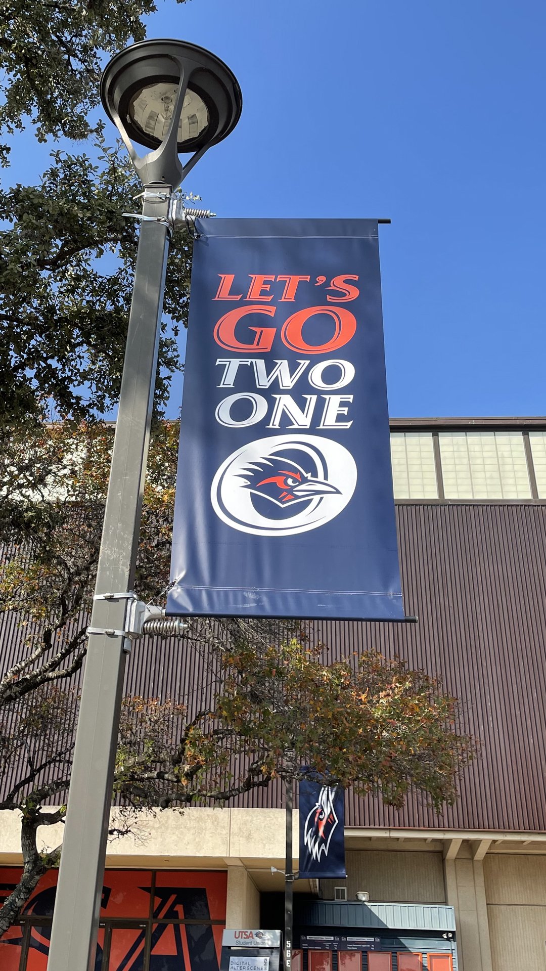
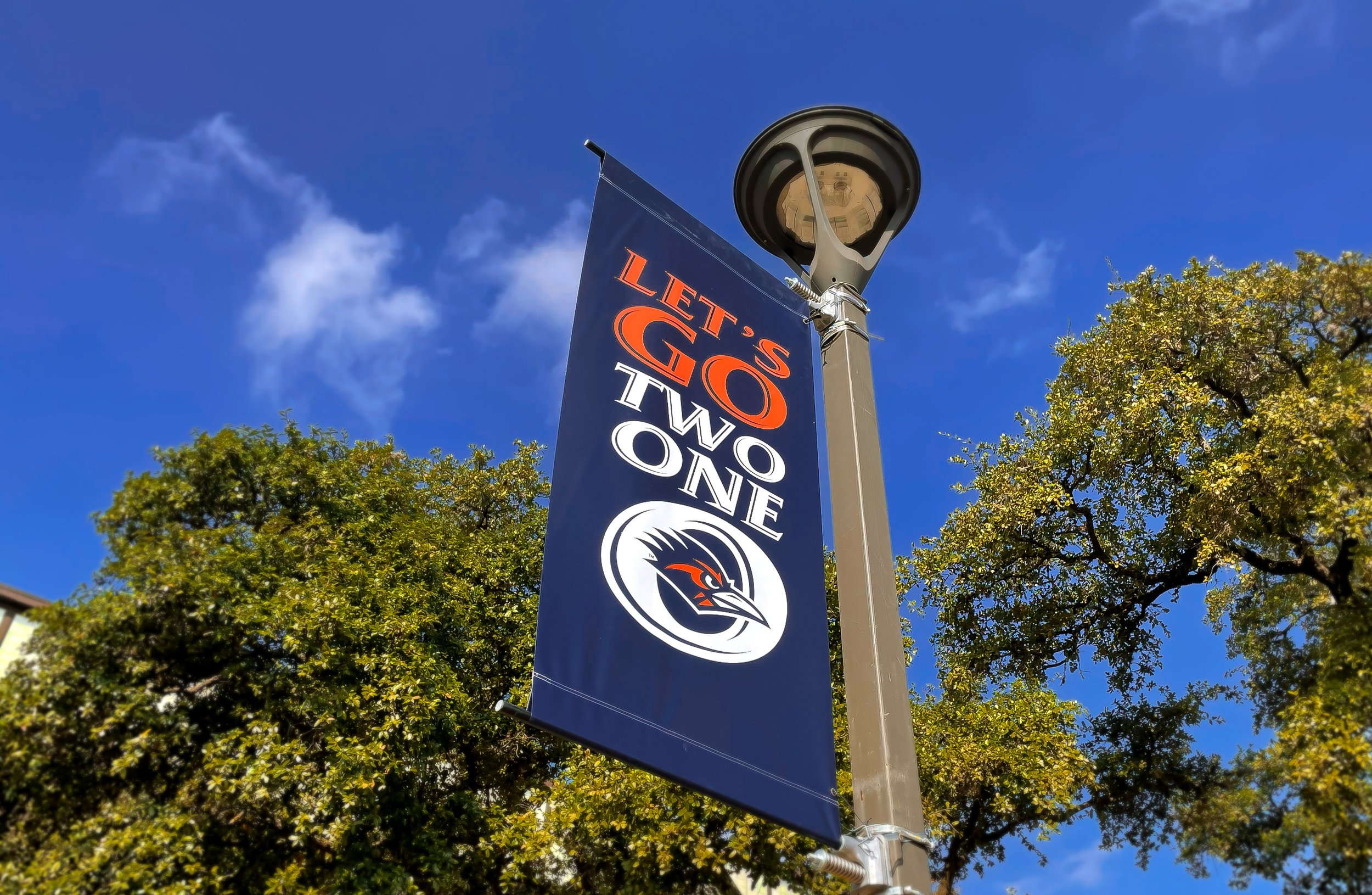
I proposed banner designs that were more evergreen and can last a longer time without having to worry about changing very often. To do this I utilized our current branding standards of using our logo and word marks as well as adding our Spirt and battle cry marks.Using our colors we laid out a map to interchange each branding element.
Outcome
The overall goal to build upon our current branding standards for UTSA Athletics by having a creative solution that is timeless. This helps to build longevity for these banners that see a lot of foot traffic on a daily basis. By utilizing the simplicity of current logo marks and colors helped to bring some life to the front walk way of the Convocation Center for our fans.
Also adding to the initiative of “Let’s Go 210” as a new battle cry to tie together our university and city.